Executive summary
This consolidated page brings together the strongest outputs from the Victorian public transport intelligence project:
patronage recovery, station-entry change, GTFS timetable supply, station pressure proxies, train passenger-count loads,
AM/PM peak directionality, Footscray and inner-west movements, validation-gap screening, and two new public-facing network pressure maps.
34Visuals selected: 32 analytical charts plus 2 new network pressure maps
84Files scanned in the publictransport web directory
11HTML pages found
60Images / graphs found
43Best graph candidates ranked
Main finding:
Victoria's public transport recovery is not one simple story. CBD-heavy rail and tram activity remains structurally weaker
than 2019, but other parts of the network have grown or recovered strongly. The new passenger-count layer adds a deeper view:
it shows where people board and alight, where maximum train loads appear, how AM and PM peaks differ by direction, and how
stations such as Footscray function as major interchange nodes. The new map layer turns the same passenger-count logic into public-facing network graphics that show line-level annual boardings, peak train-load pressure and western corridor structure together.
Media angles
Journalist story ideas from the data
The following story angles are based on independent analysis by Clarke Towson,
Spotswood Trailers, using Victorian public transport patronage, station-entry,
GTFS timetable-supply and train passenger-count data. These are suggested
public-interest story leads, not official Department of Transport conclusions.
Important note for journalists:
the figures compare different public transport datasets, including station entries,
passenger-count boardings/alightings, GTFS scheduled supply and maximum train
departure-load records. These measures should not be treated as interchangeable.
Lead angle
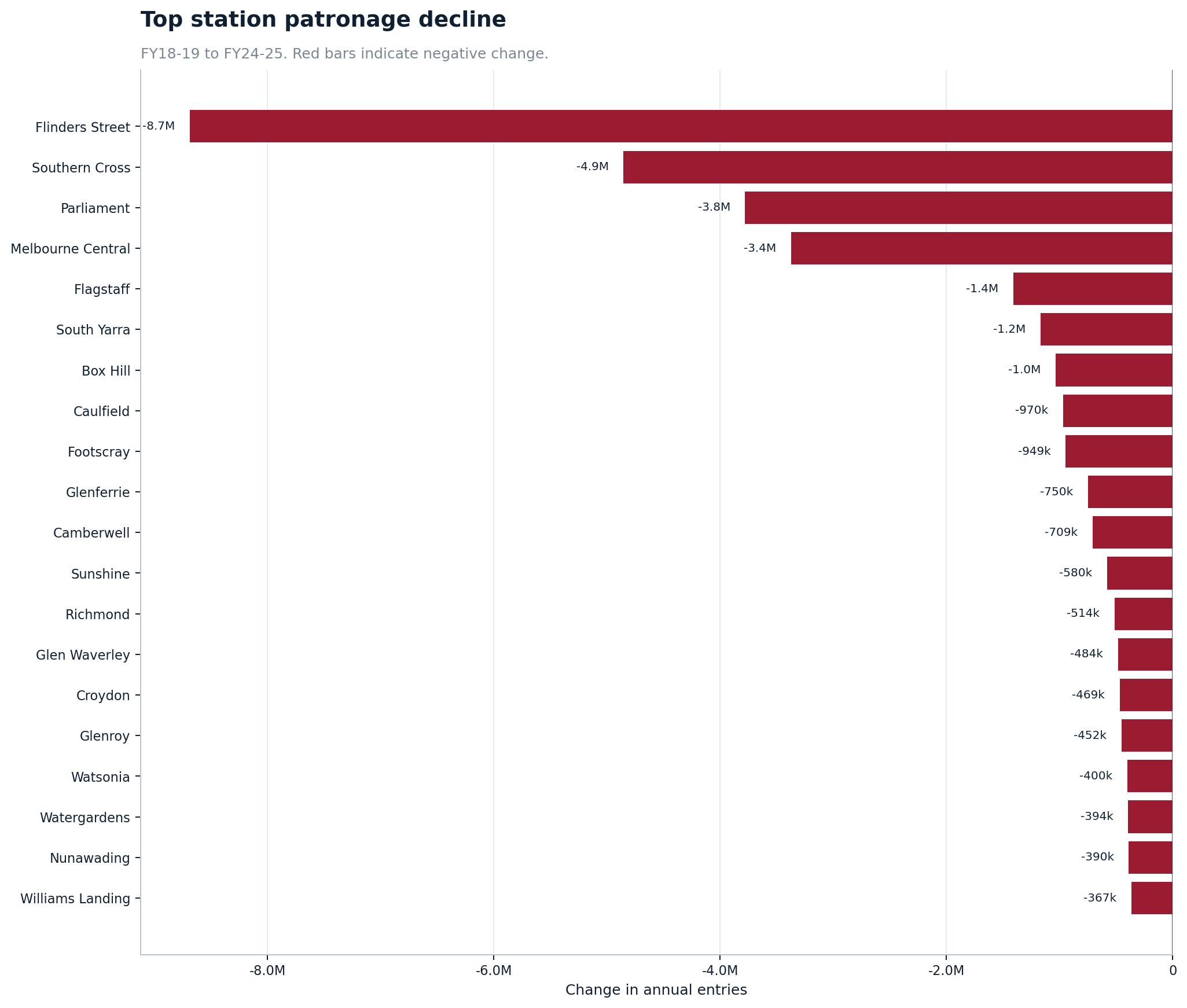
Melbourne CBD’s missing millions
CBD station-entry figures suggest the old five-day commuter pattern has not fully
returned. Flinders Street, Southern Cross, Parliament, Melbourne Central and
Flagstaff remain well below their FY18-19 levels.
- Flinders Street: about 8.7 million fewer annual entries
- Southern Cross: about 4.9 million fewer annual entries
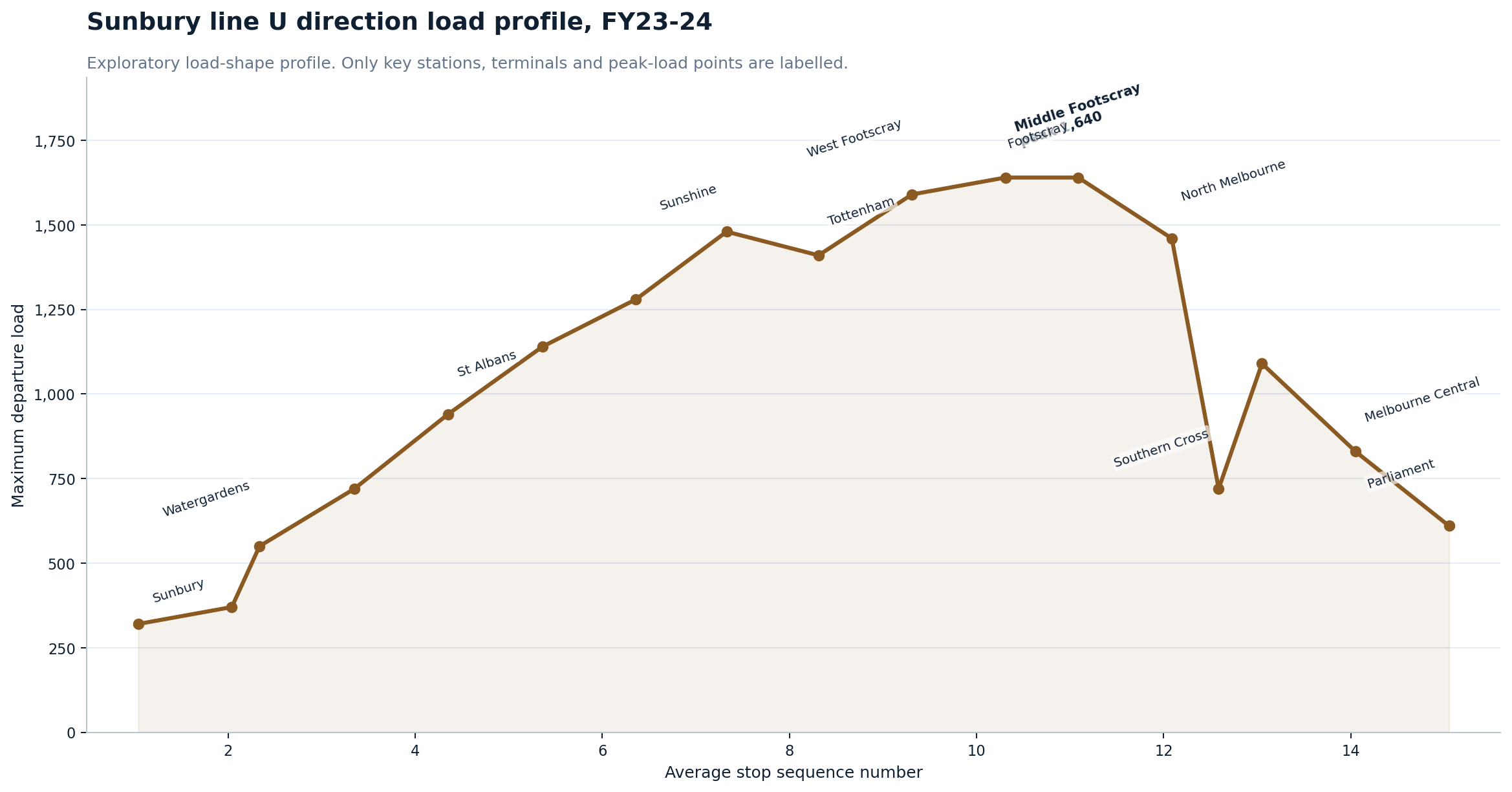
- Parliament: about 3.8 million fewer annual entries
- Melbourne Central: about 3.4 million fewer annual entries
- Flagstaff: about 1.4 million fewer annual entries
Possible headline: Melbourne CBD’s missing millions: train figures reveal city commute still wounded
Recovery shift
The network has not died — it has changed shape
The data does not show a simple public transport collapse. It shows a shift away
from the old CBD-heavy commuter model and toward stronger suburban, regional and
growth-corridor demand.
- Metro train: about 76% of 2019 patronage by 2025
- Metro tram: about 77% of 2019 patronage
- Metro bus: about 91% of 2019 patronage
- Regional train: about 119% of 2019 patronage
- Regional coach: about 104% of 2019 patronage
Possible headline: Public transport is not dead — but Melbourne’s travel map has changed
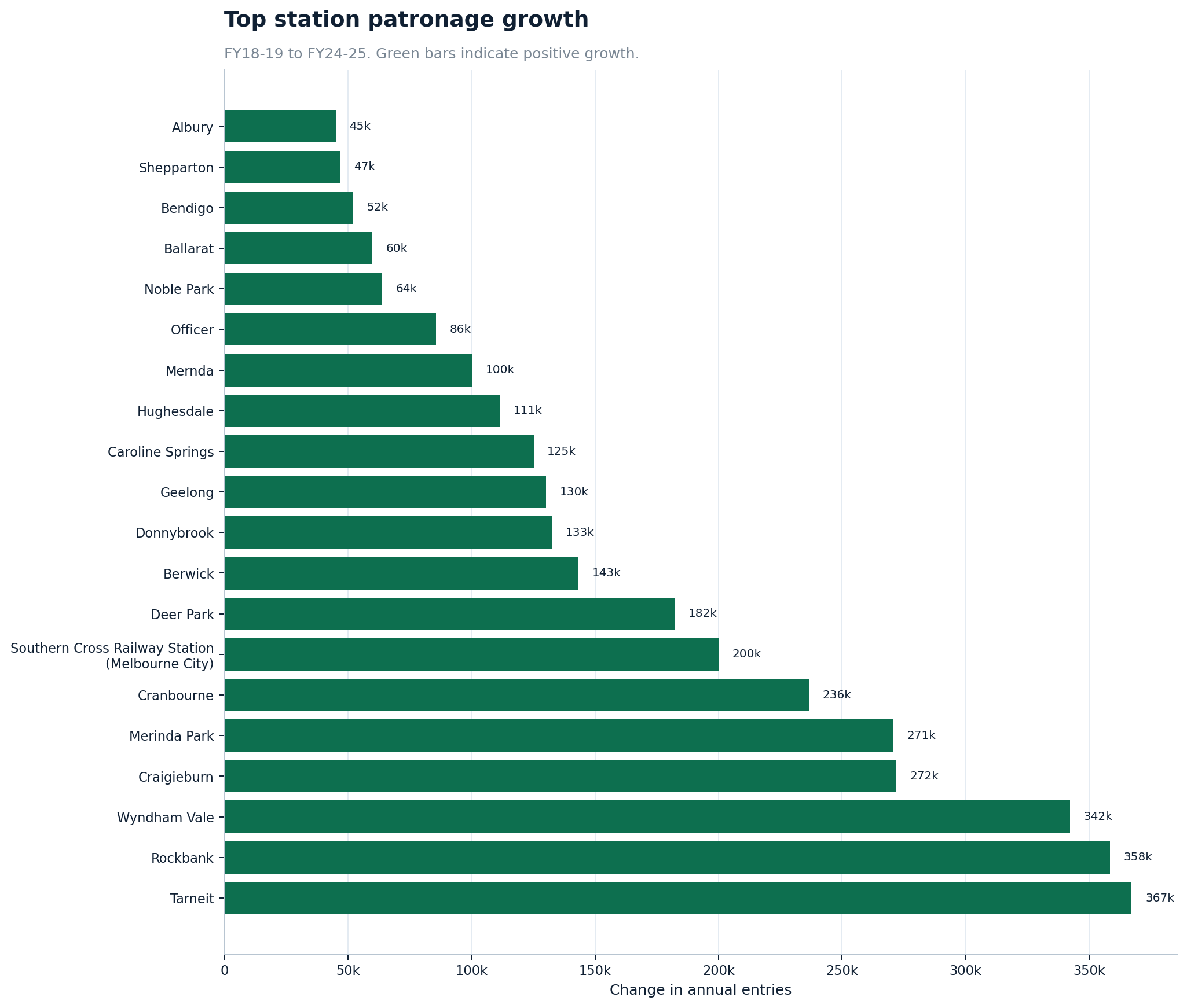
Growth corridors
Outer-growth stations are rising while CBD stations fall
Stations such as Tarneit, Rockbank, Wyndham Vale, Craigieburn and Merinda Park
point to a different Melbourne: one where growth-corridor demand is becoming
more important while the CBD commuter peak remains weaker.
Possible headline: The suburbs are rising: train data shows Melbourne’s growth-corridor shift
Western suburbs
Footscray is one of Melbourne’s key western pressure points
The inner-west analysis shows Footscray standing out as a major interchange and
redistribution point. Sunshine, North Melbourne and Newport also emerge as
important western and inner-west nodes.
- Footscray activity intensity: 22.1
- Sunshine: 16.9
- North Melbourne: 15.7
- Newport: 12.3
- Yarraville: 10.7
- Spotswood: 3.5
Possible headline: Footscray emerges as the west’s rail pressure point
Peak pressure
The busiest line is not always the most pressured train
Annual boardings and peak train loads tell different stories. Pakenham had the
highest annual boardings in the FY23-24 line analysis, but the strongest peak
departure-load figure appeared on the Belgrave line.
- Pakenham annual boardings: about 21.6 million
- Belgrave PM peak down max load: 2,380
- Williamstown PM peak up max load: 2,020
- Craigieburn AM peak up max load: 1,960
- Frankston PM peak down max load: 1,960
Possible headline: Melbourne’s hidden train crush: why annual patronage does not tell the full story
CBD concentration
A small number of stations still dominate the system
Even after the CBD decline, the public transport network remains highly
concentrated around a relatively small number of major stations. That means
changes at the biggest stations can shift the whole network story.
- Top 5 stations: about 29.9% of station entries
- Top 10 stations: about 38.9%
- Top 20 stations: about 47.8%
- Top 50 stations: about 63.7%
Possible headline: Melbourne’s rail network still depends on a handful of giant stations
Data caution
Station-entry versus passenger-count gaps need careful reporting
Some stations show large gaps between station-entry counts and passenger-count
boardings. This is interesting, especially at major interchange stations, but it
is not proof of fare evasion or wrongdoing.
The safer story is about how different datasets measure different parts of the
transport system, especially at stations where passengers transfer between lines.
Possible headline: Why station entries and passenger boardings do not always match
Open data
Independent open-data analysis turns raw transport files into public intelligence
The report shows how public datasets can be converted into maps, charts, CSV
downloads, database diagnostics and plain-English explanations. This makes the
transport system easier for ordinary people, councils, journalists and local
communities to understand.
Possible headline: The private citizen turning Victoria’s transport data into public intelligence
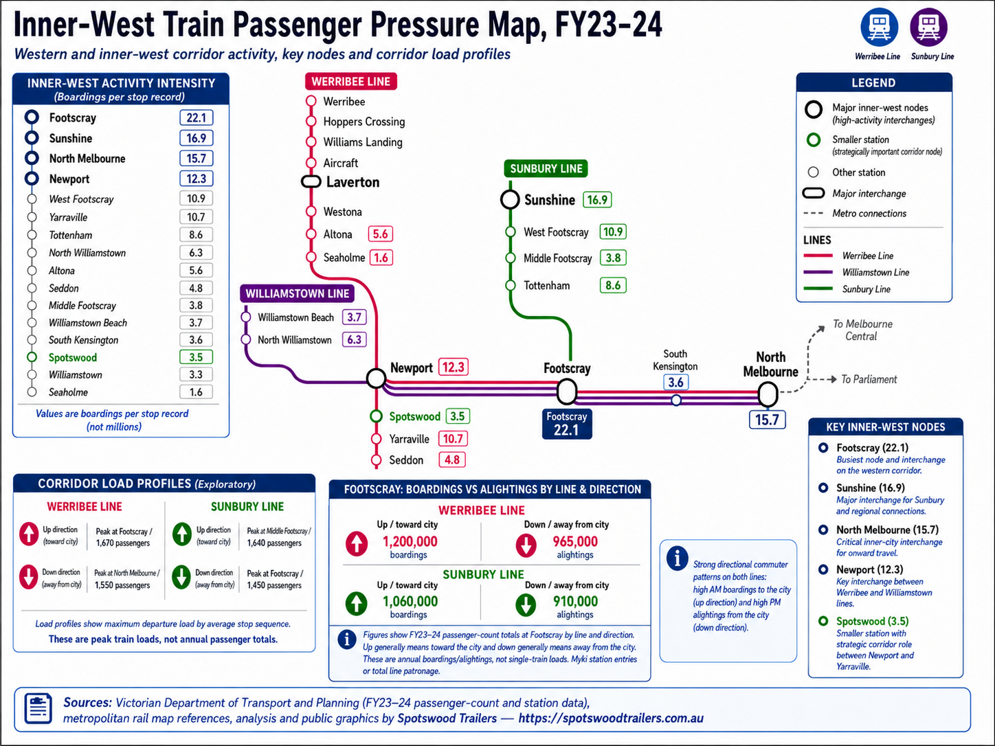
Featured map layer
Melbourne train passenger pressure maps
This update adds two public-facing schematic pressure maps. The first shows line-level annual boardings and maximum peak train-load pressure across Melbourne's metro rail network. The second zooms into the inner-west corridor, where Footscray, Sunshine, North Melbourne and Newport act as major movement and interchange nodes.
Why this layer matters:
bar charts are useful for ranking, but transport pressure is spatial. These maps show how line patronage, peak train loads, interchange stations and western-corridor structure fit together on the rail network itself.
Network pressure map findings
These two map graphics turn the passenger-count analysis into a public-facing network view. The broader Melbourne map shows line-level annual boardings and the strongest peak train-load pressure points across the metro network. The inner-west map zooms into the western corridor, including Footscray, Sunshine, North Melbourne, Newport, Spotswood, Yarraville, Laverton, Werribee and the Williamstown branch.
-
Annual boardings and peak train pressure are different measures.
Pakenham was the highest line by annual boardings in this analysis, with about 21.6 million boardings in FY23-24. The strongest peak train-load figure, however, was on the Belgrave line, where the analysis recorded a maximum load of 2,380 passengers in the PM peak down direction. Total patronage therefore does not tell the full pressure story.
-
Some line-direction peak-load points are very large.
The strongest visible peak-direction loads include Belgrave PM down 2,380, Williamstown PM up 2,020, Craigieburn AM up 1,960, Frankston PM down 1,960, Cranbourne AM up 1,840, and Pakenham / Glen Waverley AM up 1,780. These are maximum departure-load figures, not annual totals and not typical loads on every train.
-
Footscray is a major western rail pressure point.
In the inner-west activity-intensity measure used here, Footscray stands out clearly, followed by Sunshine, North Melbourne and Newport. The activity-intensity values shown on the map are boardings per stop record, not millions.
-
Spotswood is smaller, but strategically placed.
Spotswood does not have the activity level of Footscray, Sunshine or Newport, but it sits on the western corridor between Newport and Yarraville. That makes it useful to analyse as part of the broader movement system through Melbourne's west.
22.1Footscray activity intensity
16.9Sunshine activity intensity
15.7North Melbourne activity intensity
12.3Newport activity intensity
10.7Yarraville activity intensity
3.5Spotswood activity intensity
The purpose of the maps is to show where people board and alight, which direction the pressure is moving, where the biggest onboard train loads occur, which stations act as interchange points and how the western corridor connects into the broader network.
Annual boardings
Total passenger boardings recorded across each line during FY23-24. This is a whole-year volume measure.
Peak train load / max load
The maximum average departure load at the busiest point on the line and in the stated direction. This is a crowding-pressure measure, not annual patronage.
Inner-west activity intensity
Boardings per stop record, used as a simple station-activity comparison. These values are not millions.
M1
Network map
Melbourne Train Passenger Pressure Map, FY23-24
A schematic network-wide map showing annual boardings, maximum peak train loads and the direction/peak period of each line's strongest pressure point. The map makes clear why annual patronage and peak train-load pressure need to be read as different measures.
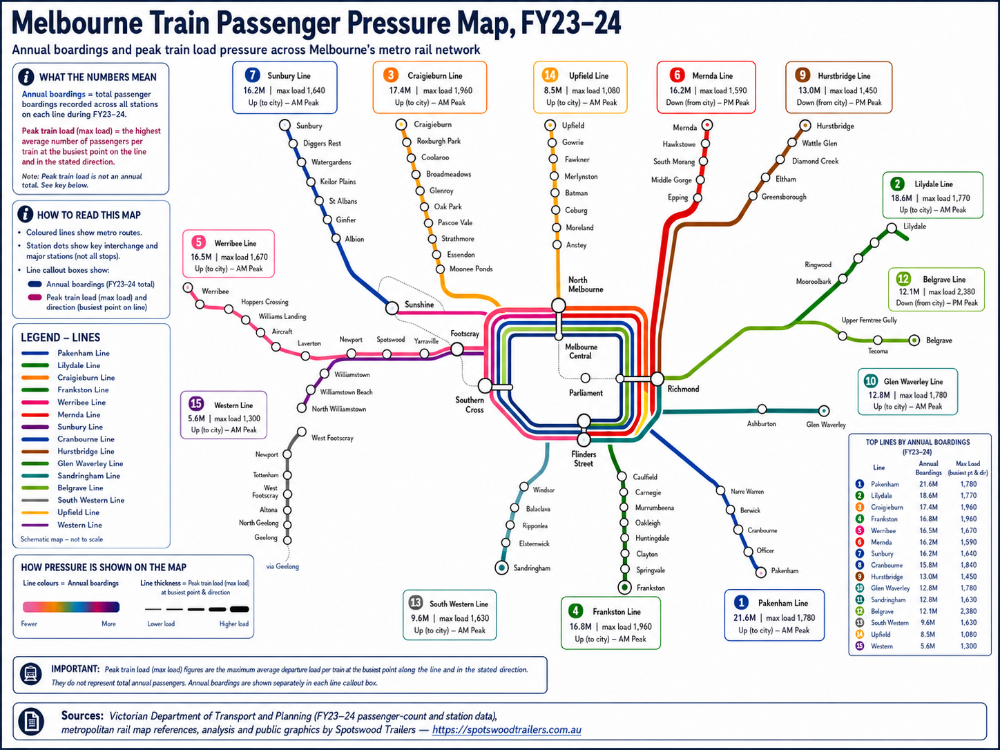
External graphic: charts/network_pressure/melbourne_rail_passenger_pressure_map.png
M2
Inner-west map
Inner-West Train Passenger Pressure Map, FY23-24
A corridor-focused view of the Werribee, Williamstown and Sunbury-linked inner-west movement pattern. Footscray stands out as the strongest inner-west activity node, with Sunshine, North Melbourne and Newport also playing major interchange roles. Spotswood is smaller in activity terms but is highlighted because it sits on a strategically important corridor between Newport and Yarraville.
External graphic: charts/network_pressure/inner_west_train_passenger_pressure_map.png
Map interpretation cautions
- Annual boardings are whole-year totals by line. They are not the same as peak crowding.
- Peak train load / max load is a maximum departure-load pressure measure for a line, direction and peak period. It is not a count of every train and not annual patronage.
- Footscray boardings and alightings are passenger-count totals at Footscray by line and direction, not Myki station entries and not total line patronage.
- Activity intensity values are boardings per stop record and are used only as a comparative station-activity metric.
- The maps are schematic public explanation graphics, not official government maps or engineering diagrams.
Section
1. Patronage recovery and structural shift
This section shows the big-system story: patronage did not simply disappear after COVID. It redistributed across modes, locations and travel purposes. CBD-heavy rail and tram activity remains weaker than 2019, while regional and outer-growth patterns are much stronger.
Patronage recovery and demand shift findings
This layer combines public transport patronage data, station-entry data and GTFS timetable supply data. GTFS is the General Transit Feed Specification: the standard format used for stops, routes, trips and scheduled stop times.
The main finding is not simply that public transport patronage fell after COVID. The larger story is that demand appears to have shifted. CBD and inner-city commuter-heavy stations remain below their pre-COVID levels, while regional train, regional coach, outer-growth and some suburban stations have recovered more strongly.
76%Metropolitan train recovery versus 2019
77%Metropolitan tram recovery versus 2019
91%Metropolitan bus recovery versus 2019
119%Regional train recovery versus 2019
104%Regional coach recovery versus 2019
The CBD station decline is concentrated around the traditional CBD hierarchy: Flinders Street, Southern Cross, Parliament, Melbourne Central and Flagstaff. At the same time, growth-corridor stations such as Tarneit, Rockbank, Wyndham Vale, Craigieburn and Merinda Park show the other side of the story. This is better read as a redistribution story than a simple decline story.
The station concentration results also matter: a relatively small number of stations carry a very large share of station-entry patronage. When the biggest CBD stations fall, the whole network story changes.
01
02_annual_mode_recovery_heatmap.png
Annual mode recovery heatmap
What it shows
Shows each mode's annual recovery level compared with its pre-COVID baseline.
Why it matters
This is the highest-level strategic chart because it separates the recovery story by mode instead of treating public transport as one single system.
Read carefully
This is a mode-level recovery index, not a capacity or crowding measure.
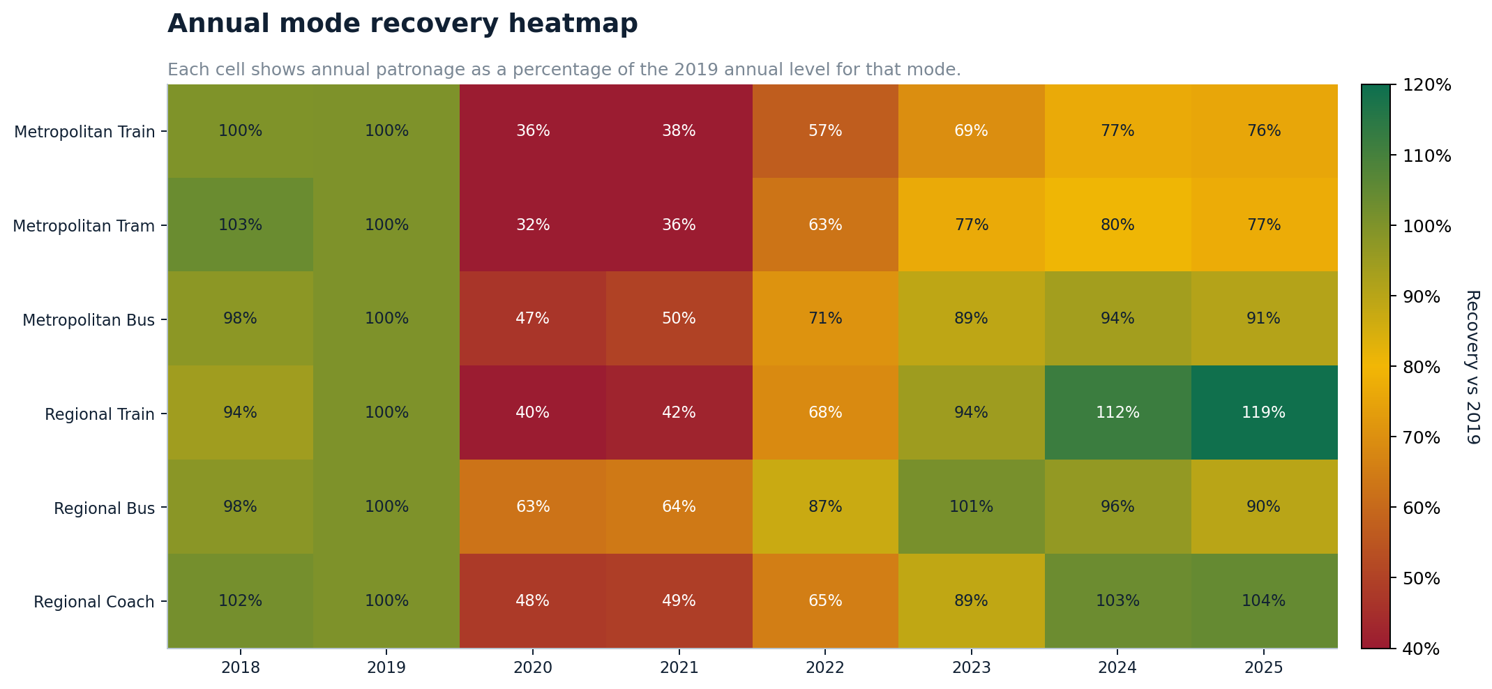
Source graph: charts/recovery_and_shift/02_annual_mode_recovery_heatmap.png
02
01_monthly_recovery_index_by_mode.png
Monthly recovery index by mode
What it shows
Shows the month-by-month recovery path for major public transport modes.
Why it matters
It reveals whether recovery is stable, seasonal, still climbing, or flattening.
Read carefully
Short-term monthly movement can reflect holidays, calendar effects and partial-month source data.
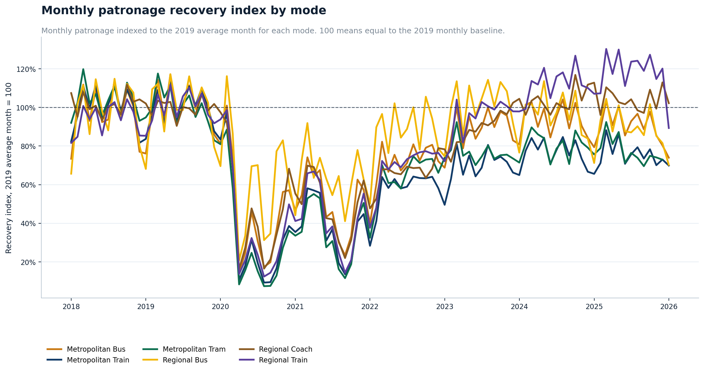
Source graph: charts/recovery_and_shift/01_monthly_recovery_index_by_mode.png
03
02_latest_complete_month_patronage_by_mode.png
Latest complete month patronage by mode
What it shows
Compares total patronage by mode for the latest complete reporting month.
Why it matters
It gives a simple current snapshot before the report moves into station and corridor-level analysis.
Read carefully
A single month should not be read as the whole long-term trend.
Source graph: charts/station_pressure/02_latest_complete_month_patronage_by_mode.png
04
08_station_patronage_concentration.png
Station patronage concentration
What it shows
Shows how strongly station entries are concentrated in the largest stations.
Why it matters
It explains why changes at a small number of central stations can dominate the public transport story.
Read carefully
Concentration does not mean smaller stations are unimportant locally.
Source graph: charts/recovery_and_shift/08_station_patronage_concentration.png
Section
2. CBD decline and growth winners
This section separates the CBD commuter-station decline from the growth-station story. The result is a more nuanced picture: central city stations remain huge, but many have not returned to 2019 levels, while selected outer and growth-area stations have increased.
05
03_cbd_station_patronage_decline.png
CBD station patronage decline
What it shows
Shows major CBD and central stations with large patronage declines compared with pre-COVID levels.
Why it matters
This is one of the strongest public-facing charts because it makes the hybrid-work/CBD travel shift visible.
Read carefully
A decline from 2019 does not mean these stations are small; many remain among the busiest stations in Victoria.
Source graph: charts/recovery_and_shift/03_cbd_station_patronage_decline.png
06
04_top_station_growth_winners.png
Top station growth winners
What it shows
Ranks stations with the strongest growth over the comparison period.
Why it matters
This provides the counter-story to CBD decline: some stations and corridors are growing strongly.
Read carefully
Very high percentage growth can occur from a low starting base, so absolute growth should also be considered.
Source graph: charts/recovery_and_shift/04_top_station_growth_winners.png
07
08_top_station_decline.png
Top station decline
What it shows
Ranks stations with the largest patronage decreases.
Why it matters
It provides a broader station-level decline list beyond the central-city summary.
Read carefully
Decline should be interpreted alongside station size, land use and changes in commuter behaviour.
Source graph: charts/station_pressure/08_top_station_decline.png
08
07_top_station_growth.png
Top station growth
What it shows
Ranks stations with the strongest increase in station entries.
Why it matters
It identifies stations and growth areas where demand has strengthened.
Read carefully
Growth charts should be read with absolute entries, not just percentage change.
Source graph: charts/station_pressure/07_top_station_growth.png
Section
3. GTFS supply and station-pressure layer
This section joins annual station-entry data to the GTFS timetable supply layer. The result is a pressure proxy: how much recorded station-entry demand sits against scheduled service supply. It is not a formal crowding measure, but it is a useful screening layer.
GTFS supply and station-pressure interpretation
This section matches annual station-entry demand against scheduled service-supply records from GTFS. It is a pressure proxy, not a formal crowding model. It does not account for train length, vehicle capacity, interchange behaviour, service cancellations, platform-level crowding or vehicle-by-vehicle load.
Even with those limits, it is useful as a screening tool because it highlights stations where recorded patronage appears high or low relative to timetable supply. In the refined matching layer, 315 of 316 station-entry rows were matched to GTFS timetable supply records, with 2 special-event station rows flagged separately and only 1 station row remaining unmatched.
The inner-west results are especially useful: Footscray remains the major pressure node, Yarraville and Newport show high entries per scheduled departure record, and Spotswood is smaller but notable because it is one of the selected inner-west stations showing positive recovery compared with FY18-19.
09
01_gtfs_match_quality.png
GTFS station match quality
What it shows
Shows how successfully station-entry rows matched to GTFS station/service supply records.
Why it matters
This is a data-quality foundation chart: it tells the reader how complete the station-supply matching process was.
Read carefully
Unmatched or special-event stations should be handled separately before making operational conclusions.
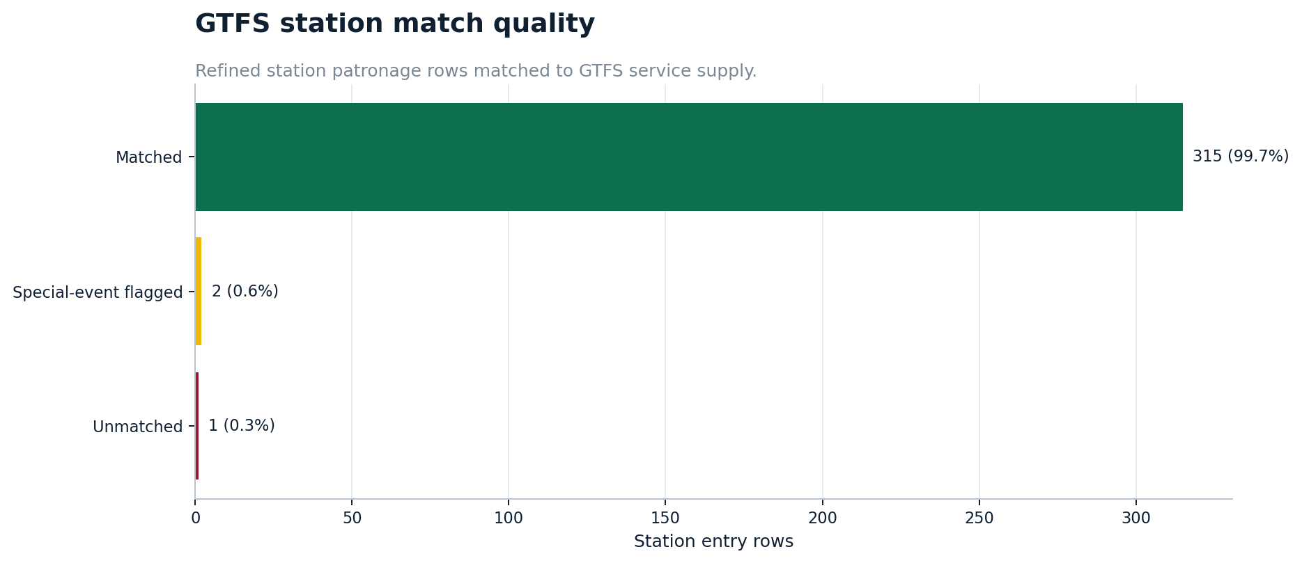
Source graph: charts/station_pressure/01_gtfs_match_quality.png
10
03_inner_west_entries_per_supply_record.png
Inner-west entries per supply record
What it shows
Shows annual station entries divided by scheduled supply records for selected inner-west stations.
Why it matters
This creates a local pressure hierarchy across Footscray, Sunshine, Newport, Spotswood and surrounding stations.
Read carefully
Entries per supply record is a proxy. It does not include train length, cancellations, passenger loads or platform capacity.
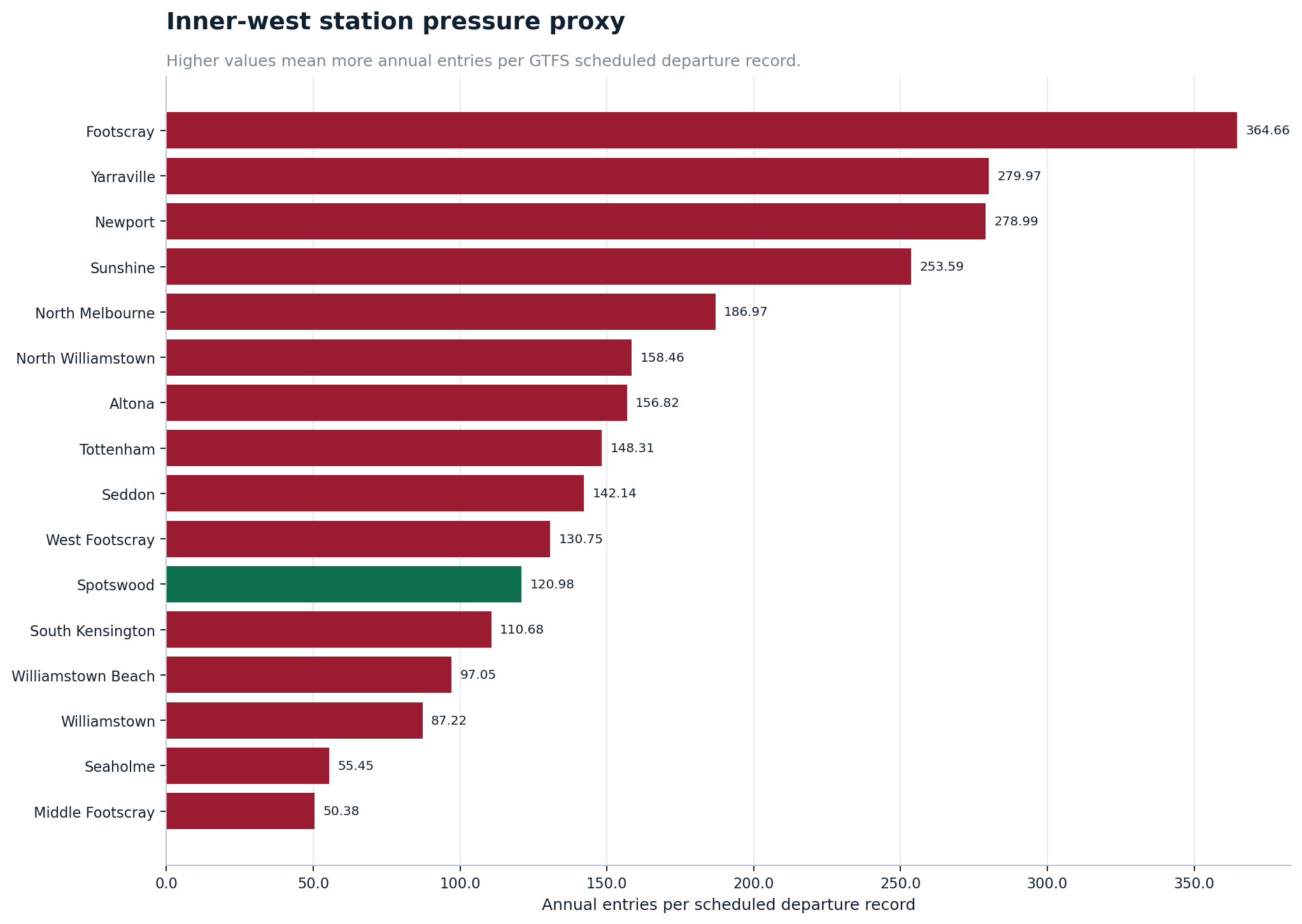
Source graph: charts/station_pressure/03_inner_west_entries_per_supply_record.png
11
04_inner_west_patronage_change.png
Inner-west patronage change
What it shows
Shows how selected inner-west station entries have changed over time.
Why it matters
It helps connect local station pressure with the broader post-COVID recovery and redistribution story.
Read carefully
Local changes can reflect nearby station competition, land use, service patterns and changing commute habits.
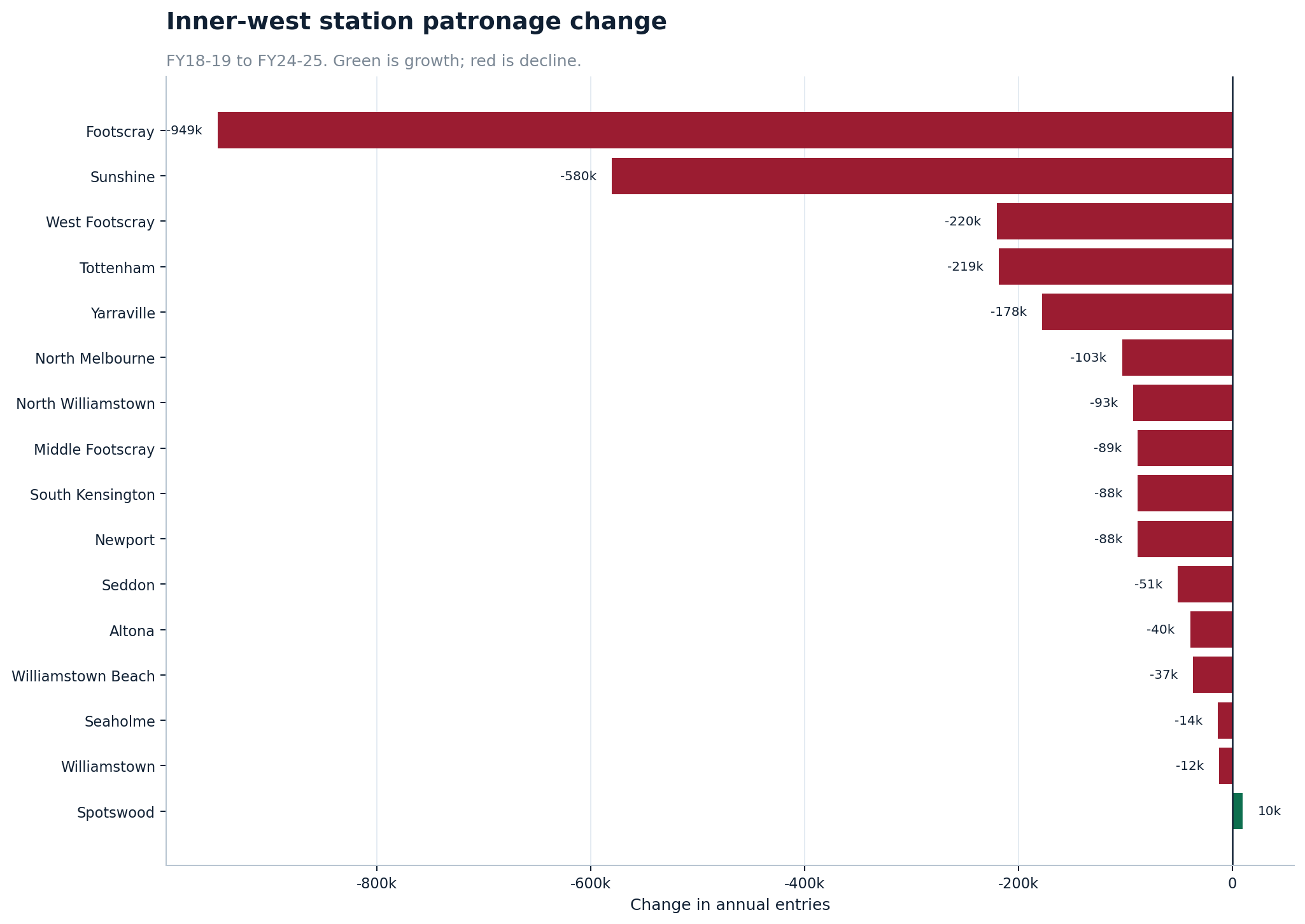
Source graph: charts/station_pressure/04_inner_west_patronage_change.png
12
06_supply_demand_pressure_quadrant.png
Supply-demand pressure quadrant
What it shows
Places stations into a quadrant using demand and supply-pressure indicators.
Why it matters
It is a useful planning-style chart because it separates high-demand/high-pressure stations from lower-pressure stations.
Read carefully
The quadrant is a screening tool, not a final priority list.
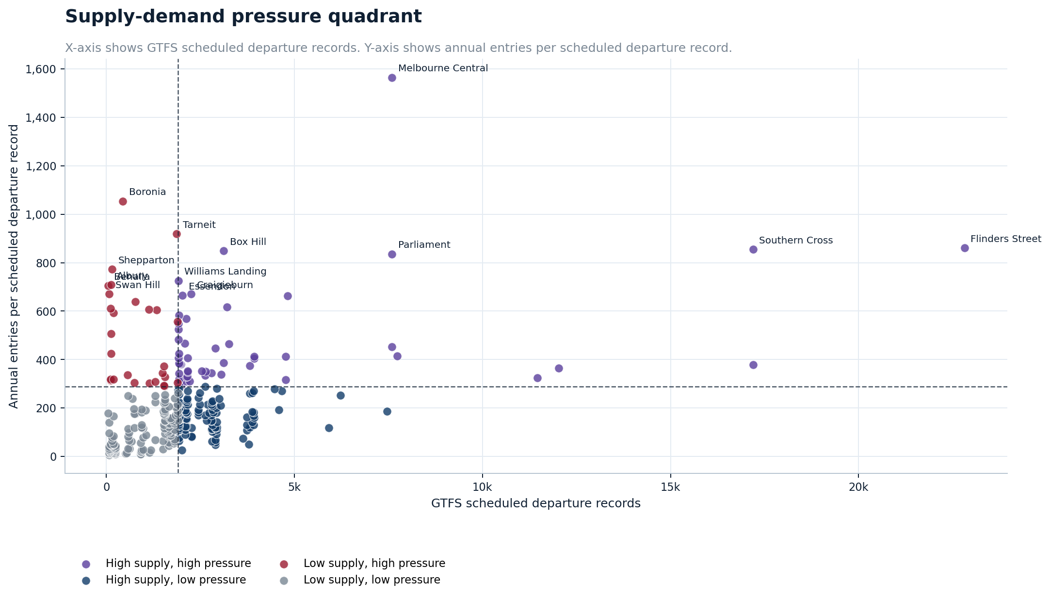
Source graph: charts/recovery_and_shift/06_supply_demand_pressure_quadrant.png
13
11_patronage_pressure_vs_supply_scatter.png
Patronage pressure versus supply scatter
What it shows
Plots station patronage pressure against scheduled service supply.
Why it matters
It shows outliers that may deserve deeper investigation.
Read carefully
Scatter outliers need context before policy conclusions are drawn.
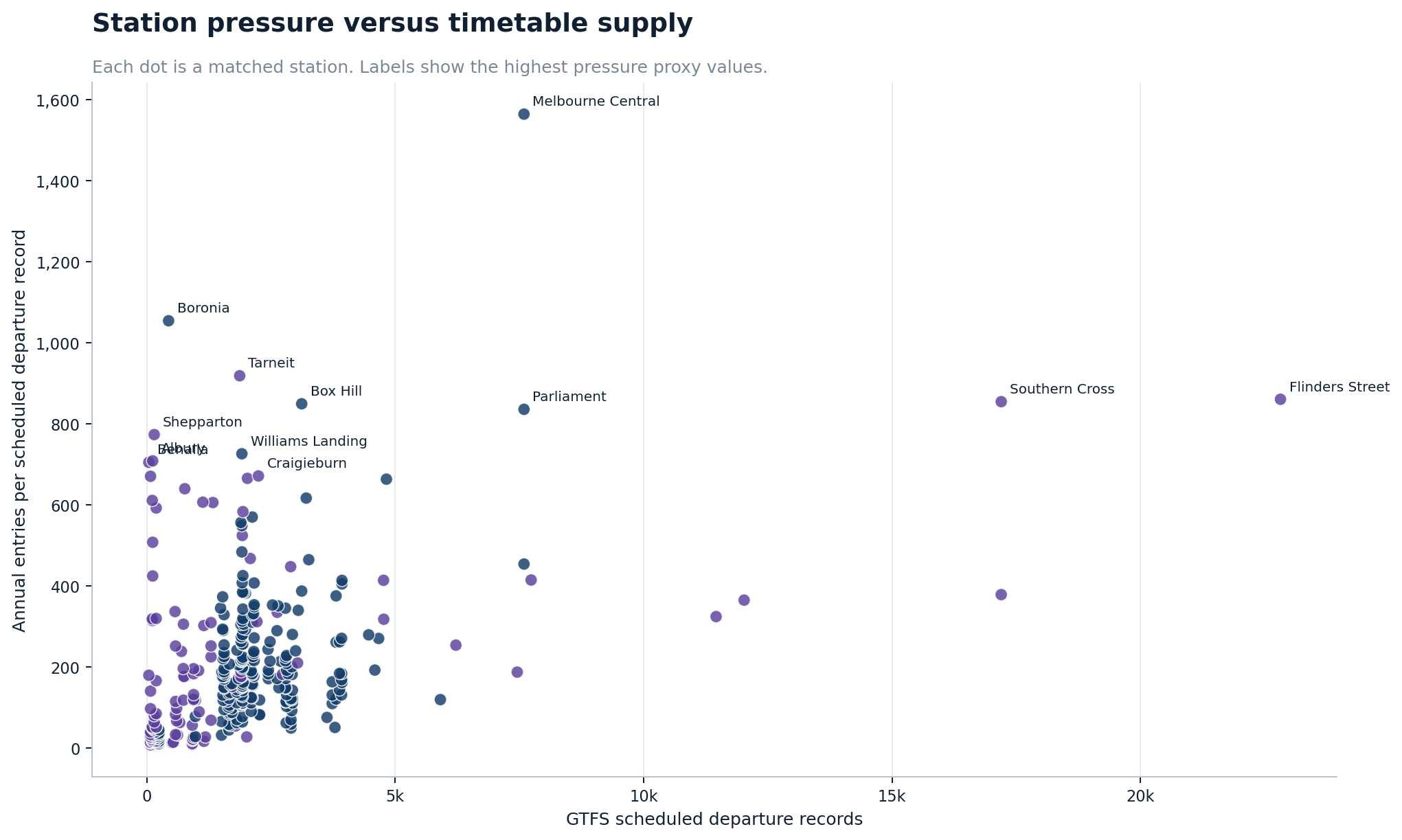
Source graph: charts/station_pressure/11_patronage_pressure_vs_supply_scatter.png
14
09_gtfs_route_supply_concentration.png
GTFS route supply concentration
What it shows
Shows how scheduled trips are concentrated among the highest-supply routes.
Why it matters
It explains how timetable supply is distributed across the network.
Read carefully
Scheduled trips are not the same as realised service, capacity, reliability or passenger load.
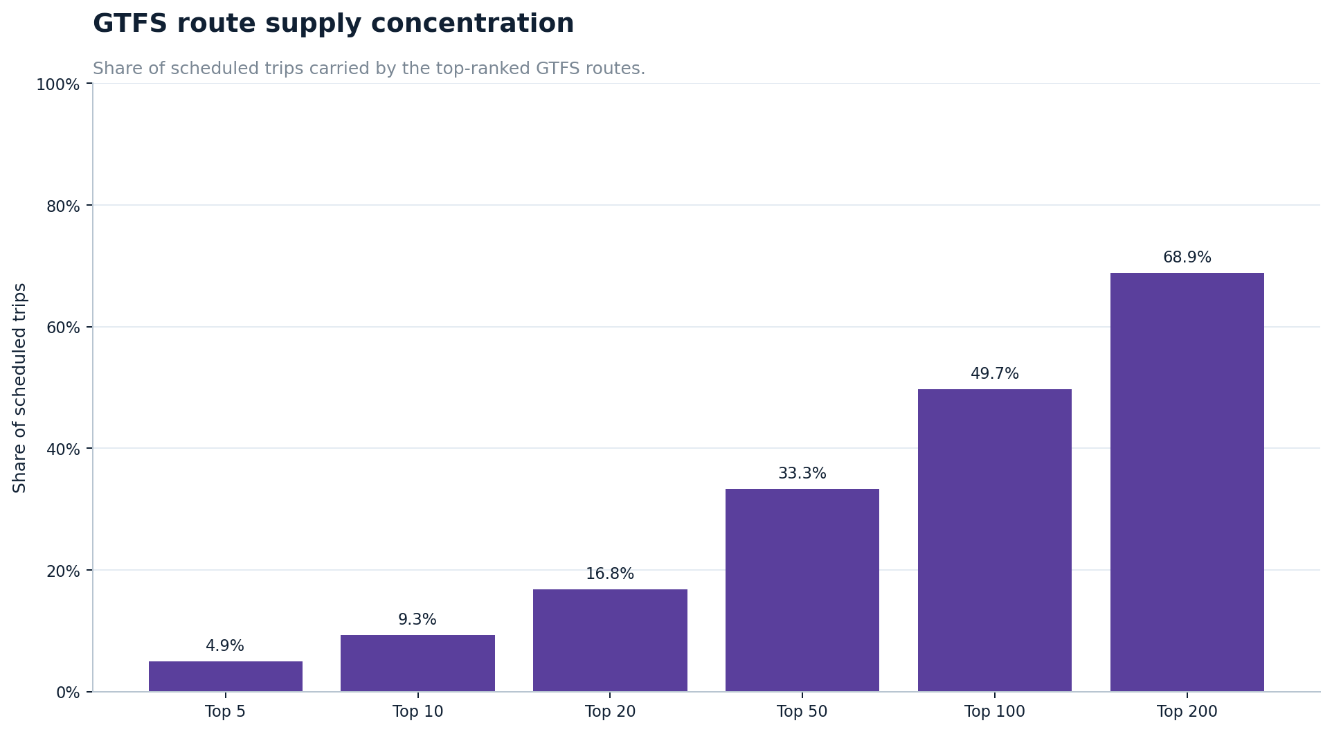
Source graph: charts/recovery_and_shift/09_gtfs_route_supply_concentration.png
15
09_top_routes_by_scheduled_trips.png
Top routes by scheduled trips
What it shows
Ranks the routes with the most scheduled trips in the GTFS feed.
Why it matters
It reveals which train, tram and bus routes dominate timetable supply.
Read carefully
High scheduled supply does not automatically imply high crowding or high demand.
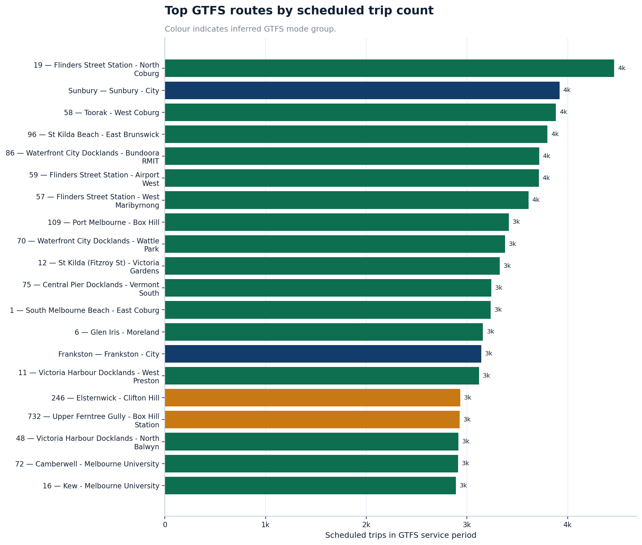
Source graph: charts/station_pressure/09_top_routes_by_scheduled_trips.png
16
10_route_type_scheduled_trip_summary.png
Route type scheduled trip summary
What it shows
Summarises scheduled trips by GTFS route type or mode group.
Why it matters
It gives the timetable-supply layer a simple mode-level view.
Read carefully
Mode groups can hide strong variation between individual routes.
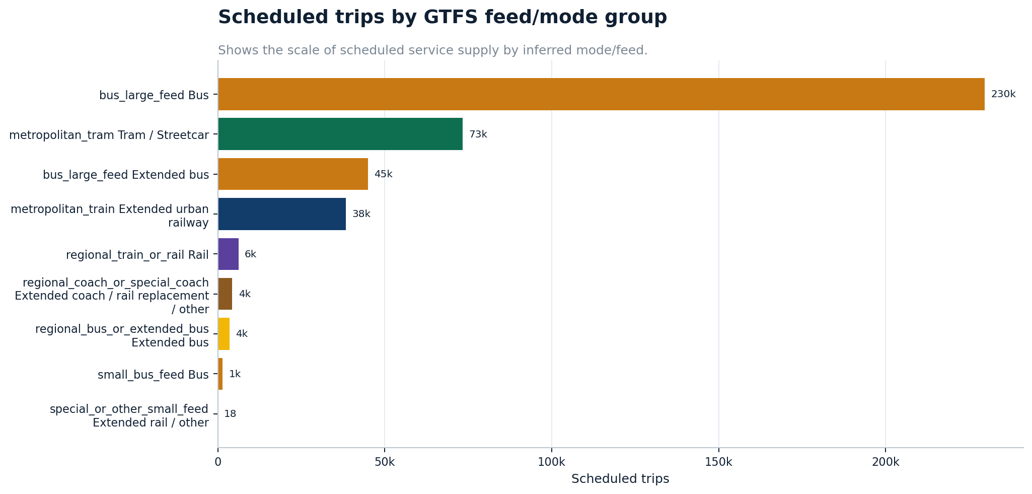
Source graph: charts/station_pressure/10_route_type_scheduled_trip_summary.png
Section
4. Train passenger-count loads and peak pressure
This is the new intelligence layer. It uses train service passenger-count records to move beyond station entries. The charts show boardings, alightings, maximum departure loads, AM/PM peak load directionality, day-type structure and the role of major interchange stations.
Train passenger-count intelligence findings
This layer uses station activity, passenger-count boardings and alightings, line-level annual boardings, direction-level peak loads, inner-west station intensity and station-entry versus passenger-count comparisons. It is designed to answer a more specific question than “which line is busiest overall?”: where is the network actually under pressure when people are trying to travel?
-
Flinders Street and Southern Cross remain in a league of their own.
By total passenger-count activity in FY23-24, Flinders Street is the clear giant, followed by Southern Cross and Richmond. The network is still highly concentrated around the CBD core and major interchange gateways.
-
The highest-boarding lines are not always the highest-pressure lines.
Top lines by annual boardings include Pakenham 21.6M, Lilydale 18.6M, Craigieburn 17.4M, Frankston 16.8M, Werribee 16.5M, Mernda 16.2M, Sunbury 16.2M and Cranbourne 15.8M. Maximum departure-load rankings tell a different and more operationally useful story.
-
AM and PM peaks behave differently.
AM peak pressure is strongly city-bound. PM peak pressure spreads outward, with very large outbound loads appearing on several line-direction combinations.
-
Footscray is a major western redistribution point.
The Footscray line-direction breakdown shows its role across Werribee, Sunbury, Williamstown and regional-corridor related movement. This confirms Footscray is not merely a busy suburban station; it is a major western interchange.
-
Station-entry versus passenger-count comparisons are diagnostic, not accusatory.
Large gaps at places such as Flinders Street, Southern Cross, Richmond, North Melbourne, Flagstaff, Parliament and Footscray show that the datasets measure different things. This is not proof of fare evasion; it is a validation-gap and methodology-screening layer.
Regional corridor labels such as “Western”, “South Western” and “Northern” come from the passenger-count data and should not be read as ordinary suburban Metro line names. They broadly refer to regional movements through corridors such as Ballarat/Western, Geelong/South Western and Bendigo/Northern. “U” means Up / toward the city, and “D” means Down / away from the city.
17
01_top_stations_boardings_alightings_final.png
Top stations by passenger-count boardings and alightings
What it shows
Compares passenger-count boardings and alightings at the largest station activity nodes.
Why it matters
It confirms the scale of Flinders Street and Southern Cross while showing Footscray as a major non-CBD activity node.
Read carefully
Passenger-count boardings and station-entry validations are related but not identical datasets.
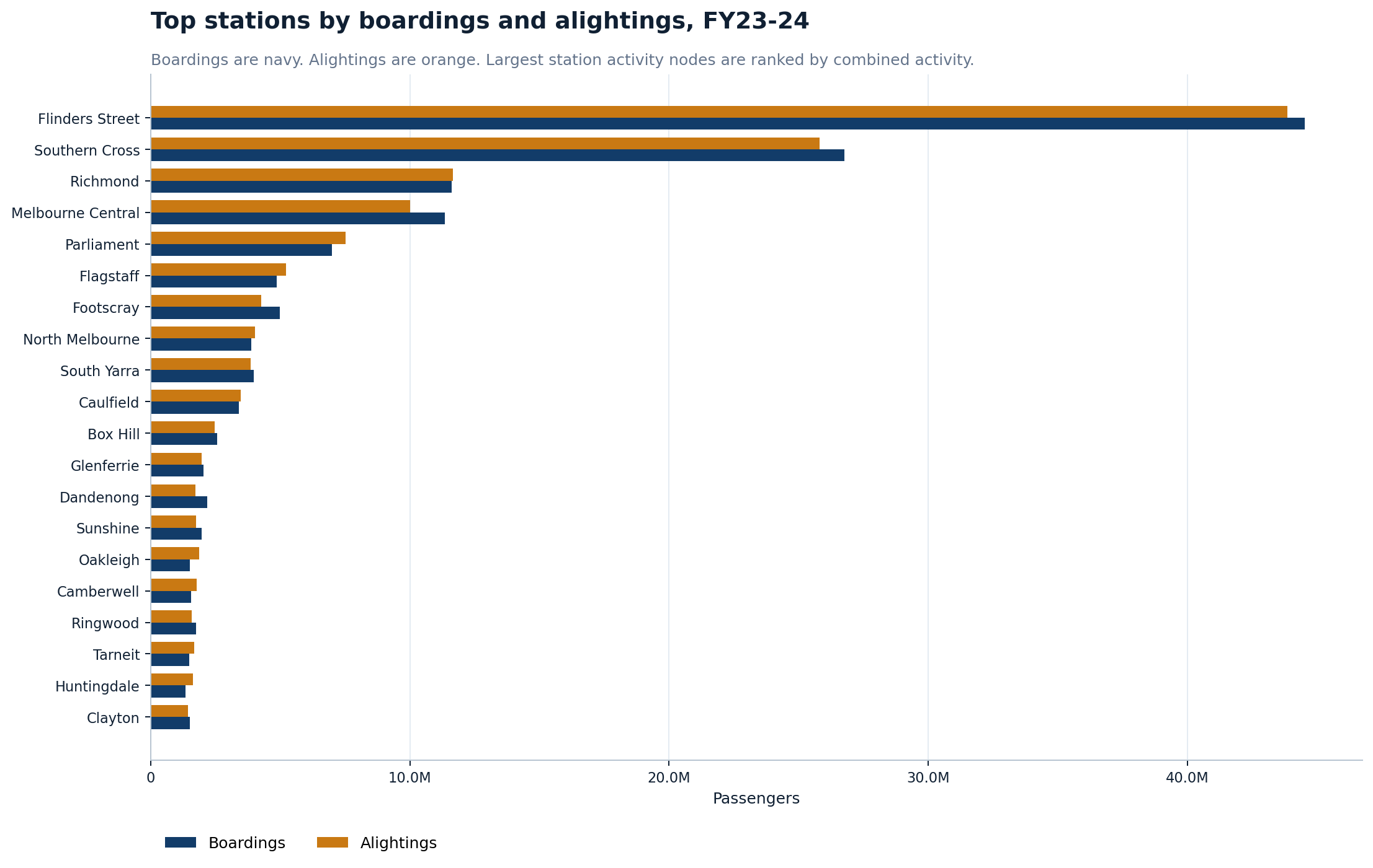
Source graph: charts/train_passenger_loads_final_public/01_top_stations_boardings_alightings_final.png
18
02_top_train_lines_boardings_with_max_load_final.png
Top train lines by boardings with maximum load
What it shows
Ranks train lines by passenger boardings and annotates maximum observed departure load.
Why it matters
This combines corridor scale and peak-load intensity in one graph.
Read carefully
Maximum load is a peak observation and should not be read as the usual load on every service.
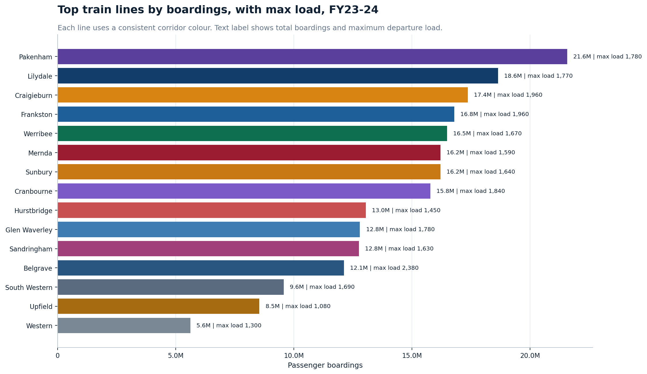
Source graph: charts/train_passenger_loads_final_public/02_top_train_lines_boardings_with_max_load_final.png
19
03_am_peak_max_loads_final.png
AM peak maximum loads
What it shows
Ranks line-direction combinations by maximum observed departure load in the AM peak.
Why it matters
It shows where the strongest morning peak loads appear and highlights the dominance of Up-direction peak movement.
Read carefully
This does not show every train; it shows the maximum observed load by line-direction grouping.
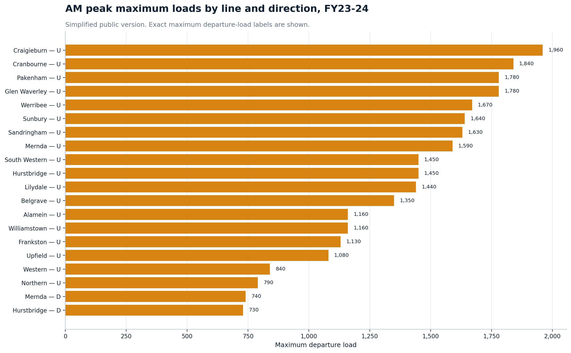
Source graph: charts/train_passenger_loads_final_public/03_am_peak_max_loads_final.png
20
04_pm_peak_max_loads_final.png
PM peak maximum loads
What it shows
Ranks line-direction combinations by maximum observed departure load in the PM peak.
Why it matters
It shows the reverse afternoon pattern, where Down-direction movements dominate many of the strongest peak loads.
Read carefully
Peak-load rankings should be read with corridor stopping patterns and service design in mind.
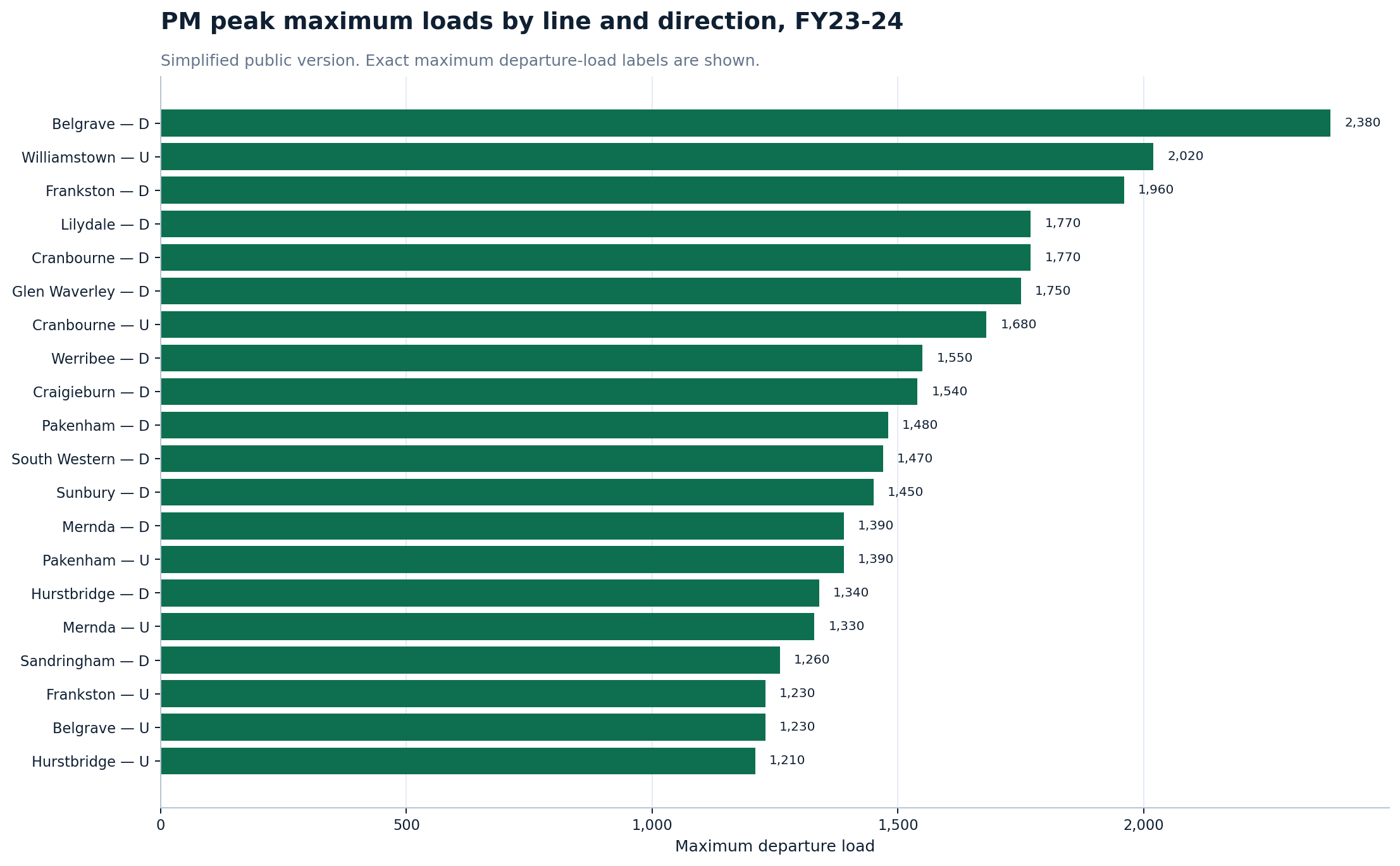
Source graph: charts/train_passenger_loads_final_public/04_pm_peak_max_loads_final.png
21
13_day_type_boardings_final.png
Passenger boardings by day type
What it shows
Splits boardings for top lines by normal weekdays, public holidays, Saturdays, school holidays and Sundays.
Why it matters
It shows how much of the train system is still driven by ordinary weekday demand.
Read carefully
Day-type categories can reflect calendar structure as well as passenger behaviour.
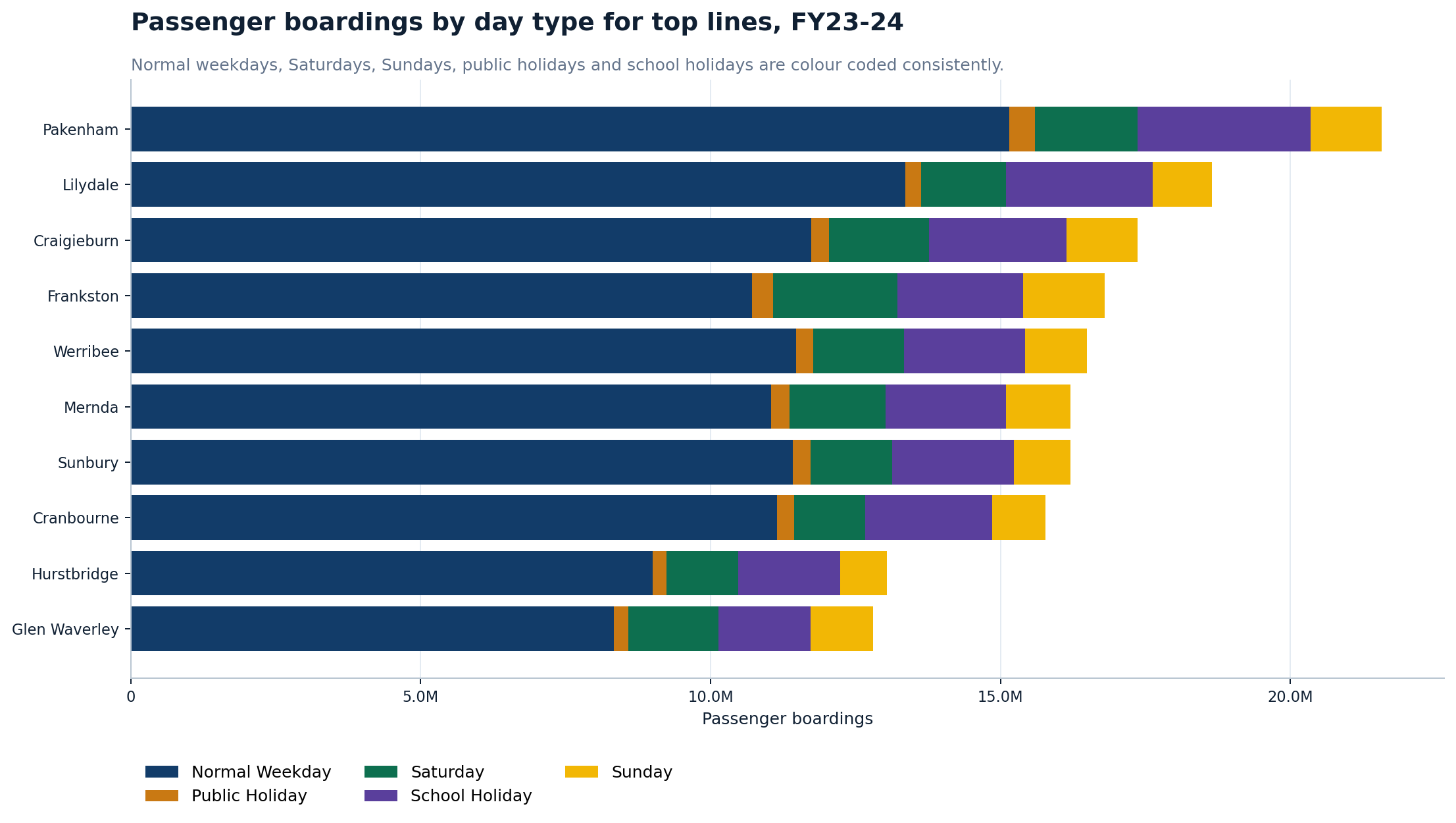
Source graph: charts/train_passenger_loads_final_public/13_day_type_boardings_final.png
Section
5. Footscray and inner-west focus
This section pulls the system-wide data down to the local inner-west story. Footscray emerges as a major interchange and passenger-count node, while Spotswood, Yarraville, Newport, Sunshine and surrounding stations sit in a clear local hierarchy.
22
05_footscray_line_direction_boardings_alightings_final.png
Footscray boardings and alightings by line and direction
What it shows
Splits Footscray passenger-count boardings and alightings by train line and direction.
Why it matters
It shows that Footscray is not just a local station; it functions as a major interchange shaped heavily by Werribee and Sunbury movements.
Read carefully
Line-direction splits should be read with interchange and stopping-pattern effects in mind.
Source graph: charts/train_passenger_loads_final_public/05_footscray_line_direction_boardings_alightings_final.png
23
06_inner_west_activity_intensity_final.png
Inner-west passenger-count activity intensity
What it shows
Shows boardings per passenger-count stop record for selected inner-west stations.
Why it matters
It ranks inner-west stations by passenger-count activity intensity and keeps Spotswood visible in the local comparison.
Read carefully
This is not a crowding measure; it is an activity-intensity proxy.
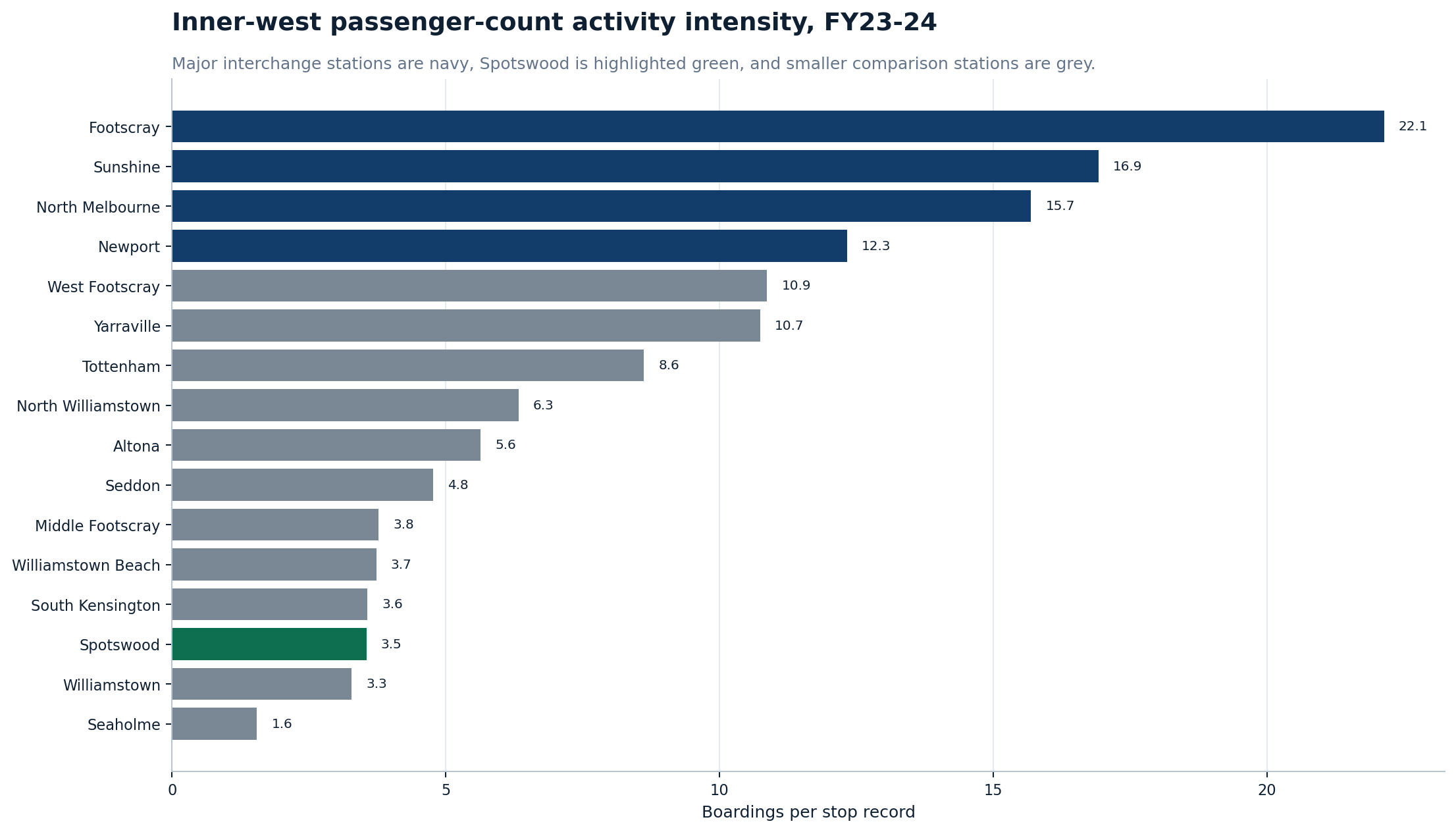
Source graph: charts/train_passenger_loads_final_public/06_inner_west_activity_intensity_final.png
24
07_inner_west_strategic_scatter.png
Inner-west strategic scatter
What it shows
Places selected inner-west stations into a strategic comparison view.
Why it matters
It helps show which local stations are large, recovering, growing or under pressure.
Read carefully
Scatter position should be interpreted with local land use, service levels and station function.
Source graph: charts/recovery_and_shift/07_inner_west_strategic_scatter.png
25
03_inner_west_entries_per_supply_record.png
Inner-west entries per supply record
What it shows
Compares station entries per scheduled supply record across inner-west stations.
Why it matters
It is one of the clearest local pressure-proxy charts.
Read carefully
It should be combined with passenger-count loads before making strong operational claims.
Source graph: charts/station_pressure/03_inner_west_entries_per_supply_record.png
Section
6. Station-entry versus passenger-count validation-gap screening
This section compares annual station-entry counts with train passenger-count boardings. It is useful for identifying places where datasets diverge, but it must be framed carefully. These charts do not prove fare evasion. They identify validation-gap, counting-methodology, interchange or data-quality candidates for further investigation.
26
10_station_entries_vs_boardings_indexed_scatter_mid_network_final.png
Indexed validation-gap scatter — mid-network
What it shows
Compares station-entry counts with passenger-count boardings while excluding the largest outliers so the mid-network can be read more clearly.
Why it matters
The numbered index makes the scatter much easier to read than station names printed over the dots.
Read carefully
This is a validation-gap screen only, not proof of fare evasion.
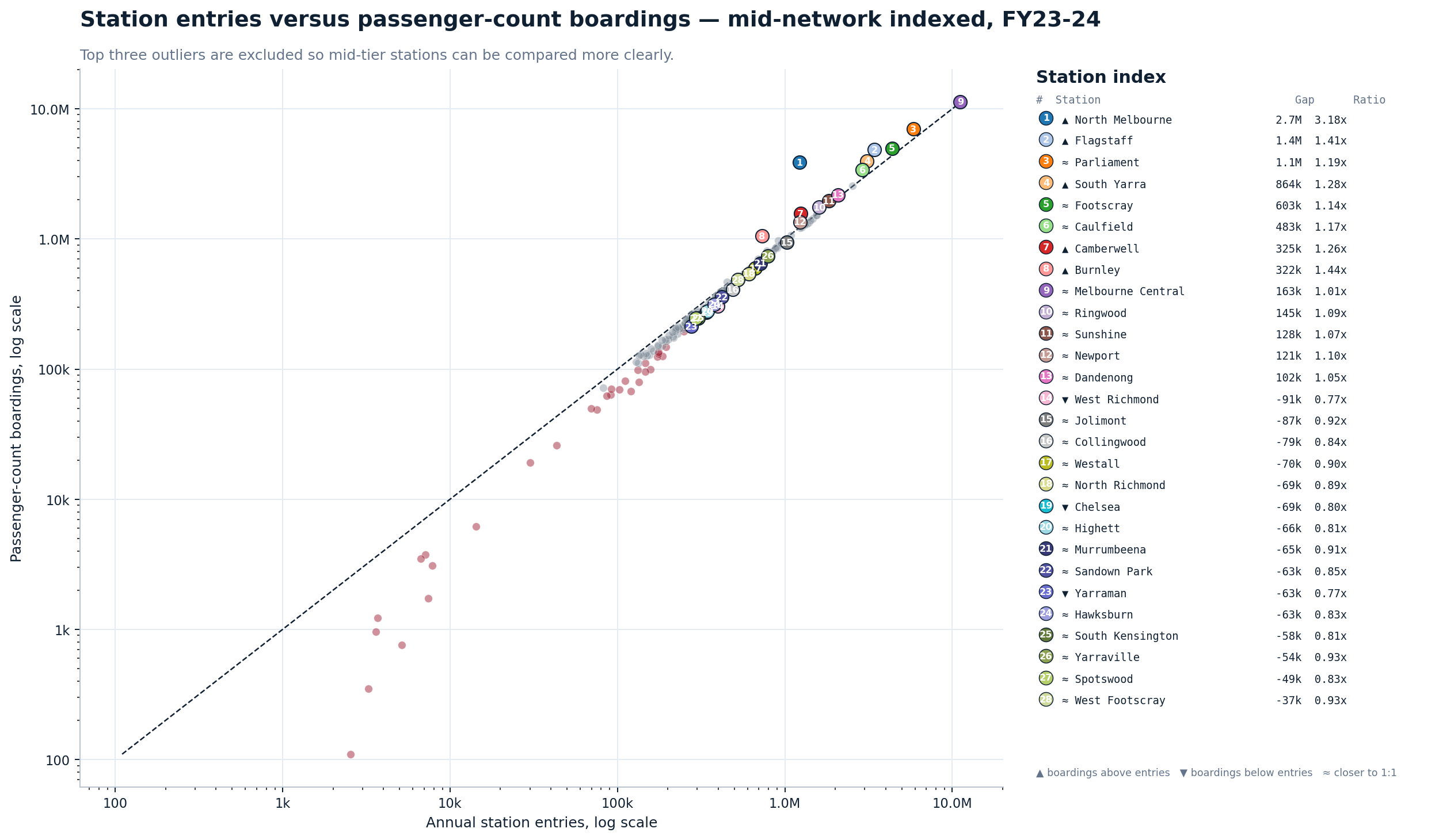
Source graph: charts/train_passenger_loads_final_public/10_station_entries_vs_boardings_indexed_scatter_mid_network_final.png
27
07_largest_station_entry_vs_boarding_gaps_final.png
Largest station-entry versus boarding gaps
What it shows
Ranks the largest differences between passenger-count boardings and station-entry counts.
Why it matters
It identifies the biggest divergence points for deeper data review.
Read carefully
Large gaps may reflect interchange, counting definitions, model methodology, or validation behaviour.
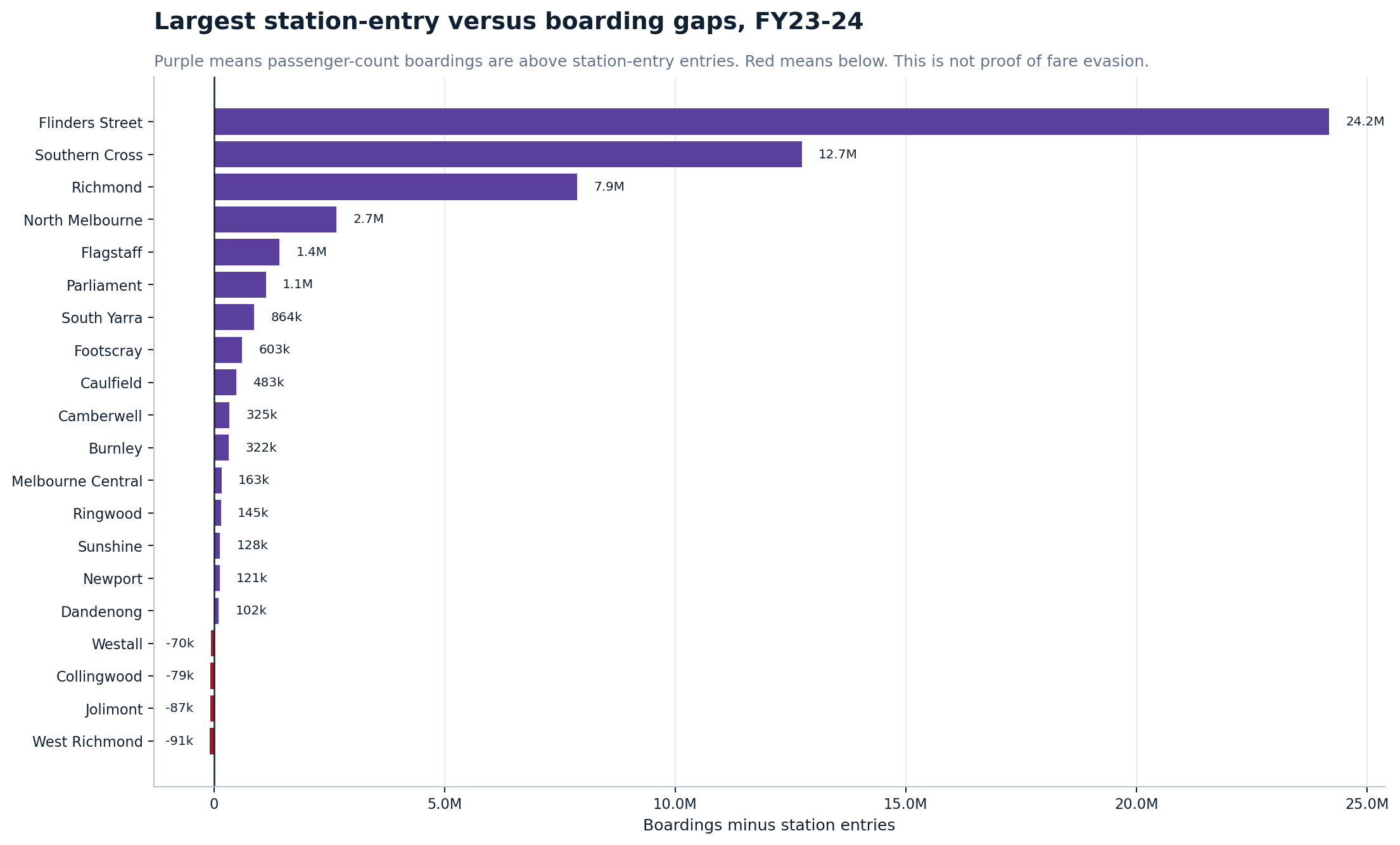
Source graph: charts/train_passenger_loads_final_public/07_largest_station_entry_vs_boarding_gaps_final.png
28
08_mid_tier_station_entry_vs_boarding_gaps_final.png
Mid-tier station-entry versus boarding gaps
What it shows
Shows validation-gap candidates after excluding the largest outliers.
Why it matters
This is better for comparing stations below the Flinders Street / Southern Cross / Richmond scale.
Read carefully
Mid-tier gaps should be investigated, not treated as conclusions.
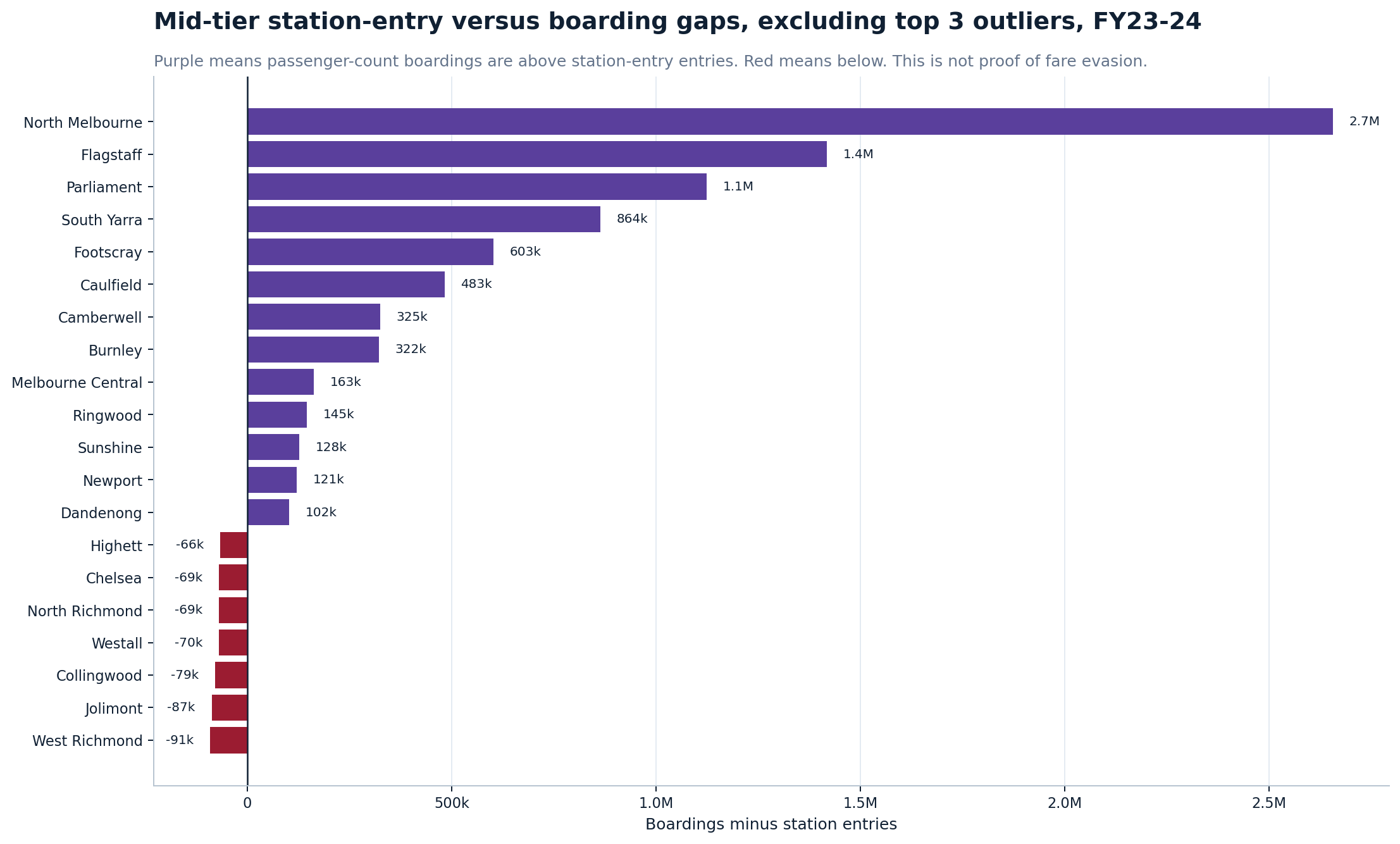
Source graph: charts/train_passenger_loads_final_public/08_mid_tier_station_entry_vs_boarding_gaps_final.png
Section
7. Technical appendix: corridor load-shape profiles
These charts are useful as a technical appendix. They show maximum departure-load shape along Werribee and Sunbury line sequences. They are not the lead public story because stopping patterns, express services, branches and City Loop routing can affect the station sequence.
29
11_werribee_down_profile_cleaner_final.png
Werribee Down-direction load profile
What it shows
Shows maximum departure-load shape across the Werribee Down-direction station sequence.
Why it matters
It helps reveal how load changes along the corridor.
Read carefully
Interpret as an exploratory load-shape profile, not a train-by-train operational diagram.
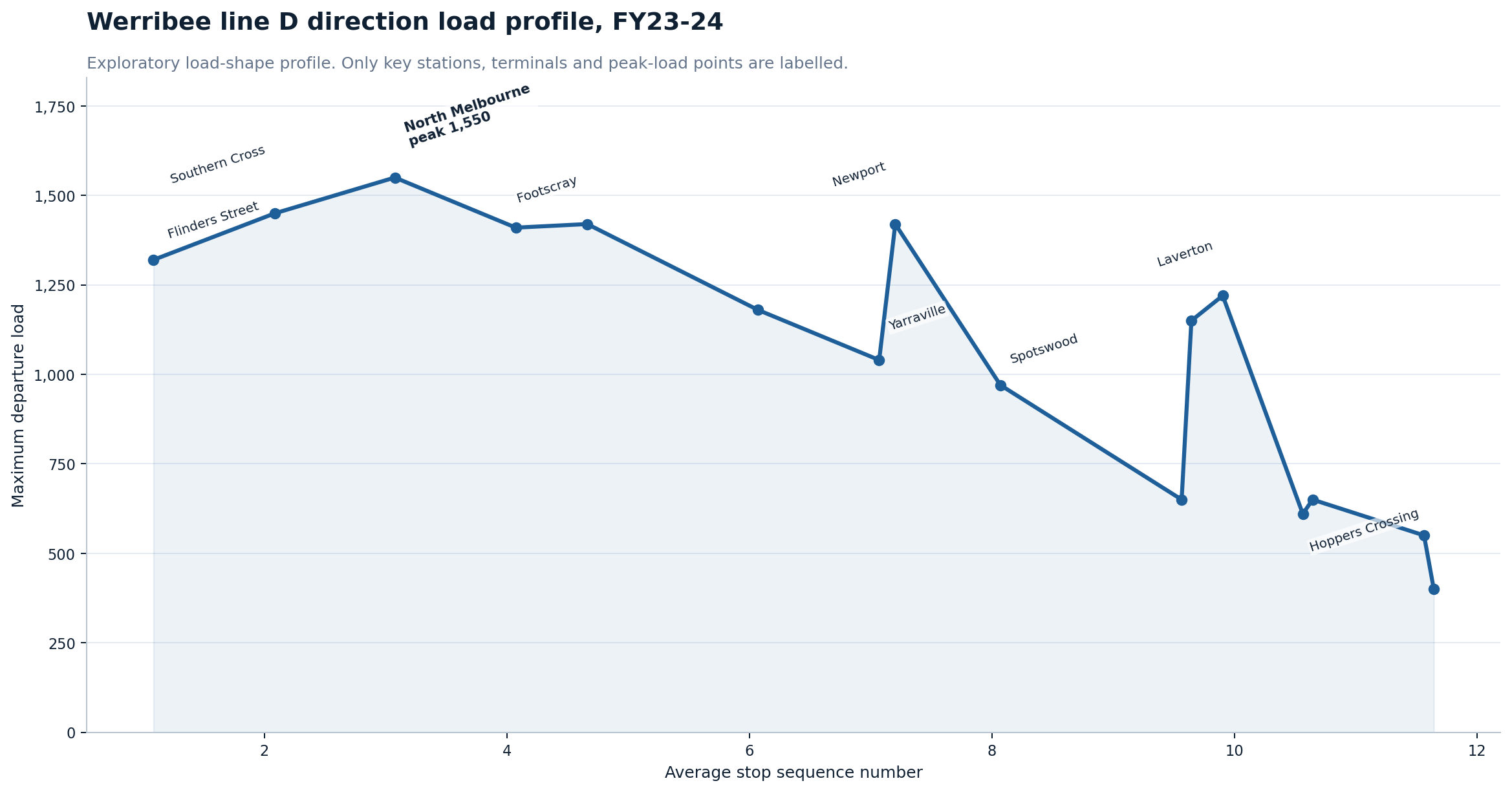
Source graph: charts/train_passenger_loads_final_public/11_werribee_down_profile_cleaner_final.png
30
12_werribee_up_profile_cleaner_final.png
Werribee Up-direction load profile
What it shows
Shows maximum departure-load shape across the Werribee Up-direction station sequence.
Why it matters
It helps show how load builds toward the inner network.
Read carefully
Stopping patterns and express services can affect the sequence.
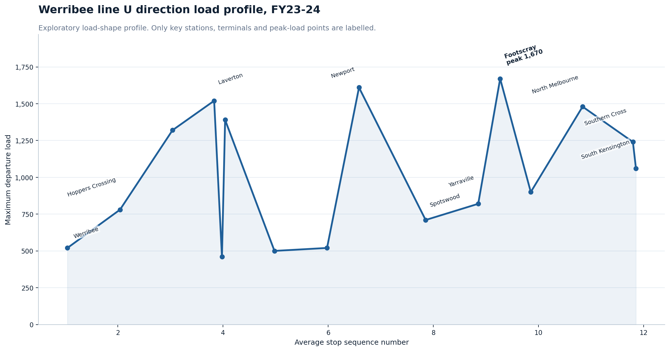
Source graph: charts/train_passenger_loads_final_public/12_werribee_up_profile_cleaner_final.png
31
14_sunbury_down_profile_cleaner_final.png
Sunbury Down-direction load profile
What it shows
Shows maximum departure-load shape across the Sunbury Down-direction station sequence.
Why it matters
It provides a western-corridor technical load-shape view.
Read carefully
City Loop and stopping-pattern effects should be considered.
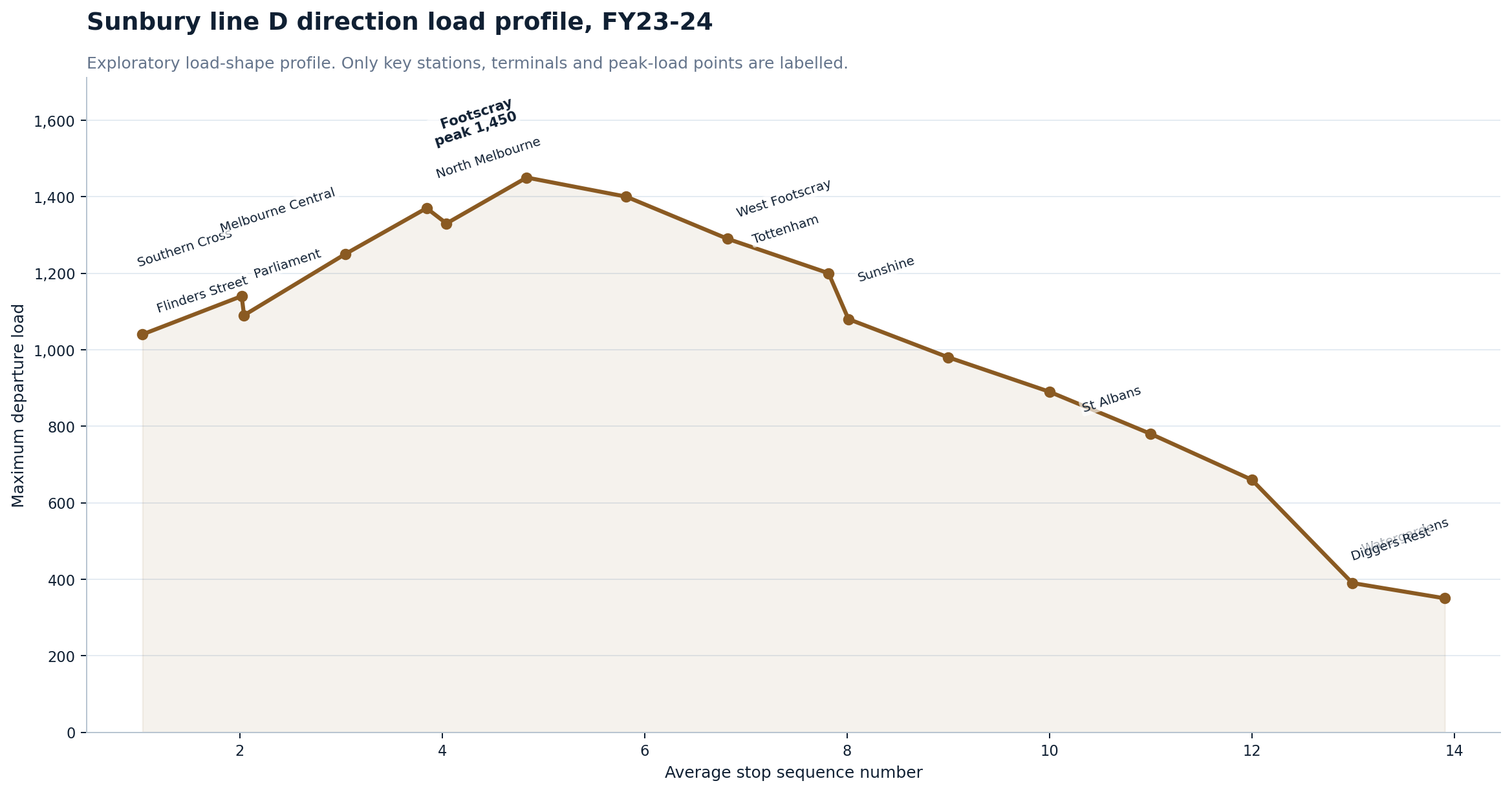
Source graph: charts/train_passenger_loads_final_public/14_sunbury_down_profile_cleaner_final.png
32
15_sunbury_up_profile_cleaner_final.png
Sunbury Up-direction load profile
What it shows
Shows maximum departure-load shape across the Sunbury Up-direction station sequence.
Why it matters
It helps show how load builds along the corridor toward the inner network.
Read carefully
Use as a technical appendix chart, not a simplified public headline chart.
Source graph: charts/train_passenger_loads_final_public/15_sunbury_up_profile_cleaner_final.png
Methodology
Methodology and cautions
This page combines multiple intelligence layers: monthly patronage by mode, annual station entries,
GTFS timetable supply, station-entry to supply matching, and train service passenger-count data.
The strongest conclusion is obtained by reading the layers together rather than treating any single chart as final.
Network pressure map methodology
The two network pressure maps added in this update are schematic explanation graphics built from the train passenger-count layer and rail network map references. They combine line-level annual boardings, maximum departure-load pressure, station activity and selected inner-west corridor movements into a single visual format for public interpretation.
They should be read as analytical graphics rather than official network maps. The line colours and station positions are simplified for readability; the numeric callouts are the important analytical layer.
Important interpretation cautions
- Station entries are not identical to passenger-count boardings.
- GTFS scheduled supply is not the same as actual delivered service, capacity or reliability.
- Entries per supply record is a pressure proxy, not a formal crowding measure.
- Maximum departure load is a peak observation, not a typical service load.
- Validation-gap charts do not prove fare evasion. They identify candidates for deeper review.
- Line profile charts are exploratory because stopping patterns, express services, branches and City Loop routing can affect station sequence.
- Network maps are schematic public explanation graphics, not official government maps or engineering diagrams.
Broken-reference check
No real broken local references were detected after ignoring embedded data: image references.
Data downloads
CSV and JSON downloads
These links expose the smaller public summary and analysis files behind this report. The large raw source files are deliberately not linked from this page; the downloads below are the cleaner CSV and JSON outputs suitable for checking the charts, reproducing the headline tables, or loading the project context into a future analysis session.
Linked public files
63 CSV/JSON files are linked below, plus 1 optional project-context text file.
Where they should live
These links expect the copy script to place files under downloads/data/ in the public transport web directory.
Note: Station-entry versus passenger-count boarding files are screening and validation outputs. They should not be described as proof of fare evasion.
Report metadata
| File | Type | What it supports | Original project path |
|---|
| Consolidated report graph selection |
CSV |
CSV used to select and organise graph candidates for the consolidated report. |
metadata/consolidated_publictransport_report_graph_selection.csv |
| Consolidated report manifest |
JSON |
Machine-readable manifest for the consolidated public transport report. |
metadata/consolidated_publictransport_report_manifest.json |
| Train passenger load report manifest |
JSON |
Manifest for the train passenger load report and its assets. |
metadata/victorian_train_passenger_load_report_manifest.json |
Patronage and recovery
Station patronage and movement
| File | Type | What it supports | Original project path |
|---|
| Inner-west station growth since FY18-19 |
CSV |
Inner-west station growth compared with FY18-19 baseline. |
output/csv/clean_reports/inner_west_station_growth_from_fy18_19.csv |
| Inner-west station history |
CSV |
Historical station patronage series for inner-west stations. |
output/csv/clean_reports/inner_west_station_history.csv |
| Latest station rankings |
CSV |
Latest available station patronage ranking table. |
output/csv/clean_reports/latest_station_rankings.csv |
| Station decline since FY18-19 |
CSV |
All-station decline comparison against FY18-19 baseline. |
output/csv/clean_reports/station_decline_from_fy18_19.csv |
| Station growth since FY18-19 |
CSV |
All-station growth comparison against FY18-19 baseline. |
output/csv/clean_reports/station_growth_from_fy18_19.csv |
| Stations without FY18-19 baseline |
CSV |
Stations that could not be compared against the FY18-19 baseline. |
output/csv/clean_reports/stations_without_fy18_19_baseline.csv |
GTFS service supply
| File | Type | What it supports | Original project path |
|---|
| Bus/coach stop service supply |
CSV |
Scheduled bus and coach service supply by stop. |
output/csv/gtfs_service_supply/bus_coach_stop_service_supply.csv |
| GTFS feed agency summary |
CSV |
Agency summary derived from the GTFS feeds. |
output/csv/gtfs_service_supply/feed_agency_summary.csv |
| GTFS feed mode map |
CSV |
Mapping between GTFS feed content and public transport modes. |
output/csv/gtfs_service_supply/feed_mode_map.csv |
| GTFS ingest summary |
JSON |
JSON summary of GTFS ingest outputs. |
metadata/gtfs_ingest_summary.json |
| GTFS service supply summary |
JSON |
JSON summary of scheduled service supply outputs. |
metadata/gtfs_service_supply_summary.json |
| Inner-west route service supply |
CSV |
Scheduled route supply focused on the inner-west area. |
output/csv/gtfs_service_supply/inner_west_route_service_supply.csv |
| Inner-west stop service supply |
CSV |
Scheduled stop supply focused on the inner-west area. |
output/csv/gtfs_service_supply/inner_west_stop_service_supply.csv |
| Route service supply |
CSV |
Scheduled service supply by route. |
output/csv/gtfs_service_supply/route_service_supply.csv |
| Route-type supply summary |
CSV |
Scheduled supply summary by route type. |
output/csv/gtfs_service_supply/route_type_supply_summary.csv |
| Stop service supply |
CSV |
Scheduled service supply by stop. |
output/csv/gtfs_service_supply/stop_service_supply.csv |
| Train stop service supply |
CSV |
Scheduled train service supply by stop. |
output/csv/gtfs_service_supply/train_stop_service_supply.csv |
| Tram stop service supply |
CSV |
Scheduled tram service supply by stop. |
output/csv/gtfs_service_supply/tram_stop_service_supply.csv |
Station pressure: patronage versus scheduled supply
Train passenger counts, boardings, alightings and load pressure
Project dictionary / future reload context
| File | Type | What it supports | Original project path |
|---|
| Future chat context |
TXT |
Compact project briefing for future chat reload. |
data_dictionary/future_chat_context.txt |
| Project data dictionary JSON |
JSON |
Structured project data dictionary for future chat reload. |
data_dictionary/data_dictionary.json |
Database backbone
Underlying DuckDB database diagnostics
The analysis is backed by a local DuckDB database containing raw-ingested and cleaned patronage,
station-entry, GTFS service-supply and train passenger-count outputs. These diagnostics
summarise the database structure so readers can see the analytical base behind the report.
24,694,810
Rows counted across base tables
5,050
Database-wide max departure load record
20,949
Max distinct GTFS stop names seen
Important interpretation: passenger-count boardings/alightings,
Myki station entries, GTFS scheduled service supply and maximum departure load are
different measures. Maximum departure load is a pressure/crowding indicator, not
annual patronage. The database-wide maximum is an audit/inventory value; the public maps
use the FY23–24 line/direction peak figures explained in the passenger-pressure section.
Largest database tables
| Table | Type | Rows |
|---|
| main.gtfs_stop_times | BASE TABLE | 15,297,769 |
| main.gtfs_shapes | BASE TABLE | 8,677,565 |
| main.gtfs_trips | BASE TABLE | 401,905 |
| main.gtfs_calendar_dates | BASE TABLE | 129,969 |
| main.train_passenger_station_daytype_summary | BASE TABLE | 98,660 |
| main.gtfs_stops | BASE TABLE | 32,097 |
| main.train_passenger_peak_load_records | BASE TABLE | 13,800 |
| main.gtfs_transfers | BASE TABLE | 13,237 |
Financial-year coverage examples
- main.monthly_average_patronage_by_daytype: 2018 to 2026
- main.monthly_patronage_by_mode: 2018 to 2026
- main.monthly_patronage_by_mode_wide: 2018 to 2026
- main.station_entries_all: FY18-19 to FY24-25
- main.station_entries_metro: FY18-19 to FY24-25
- main.station_entries_regional: FY18-19 to FY24-25
Database diagnostics generated: 2026-06-12T15:08:14. DuckDB version:
v1.5.1. Database file modified: 2026-06-12T10:35:50.
Database diagnostics summary (Markdown)
· Diagnostic SQL queries
·
Database diagnostics JSON
· Table inventory CSV
· Column inventory CSV
· Row counts CSV
· Domain metrics CSV