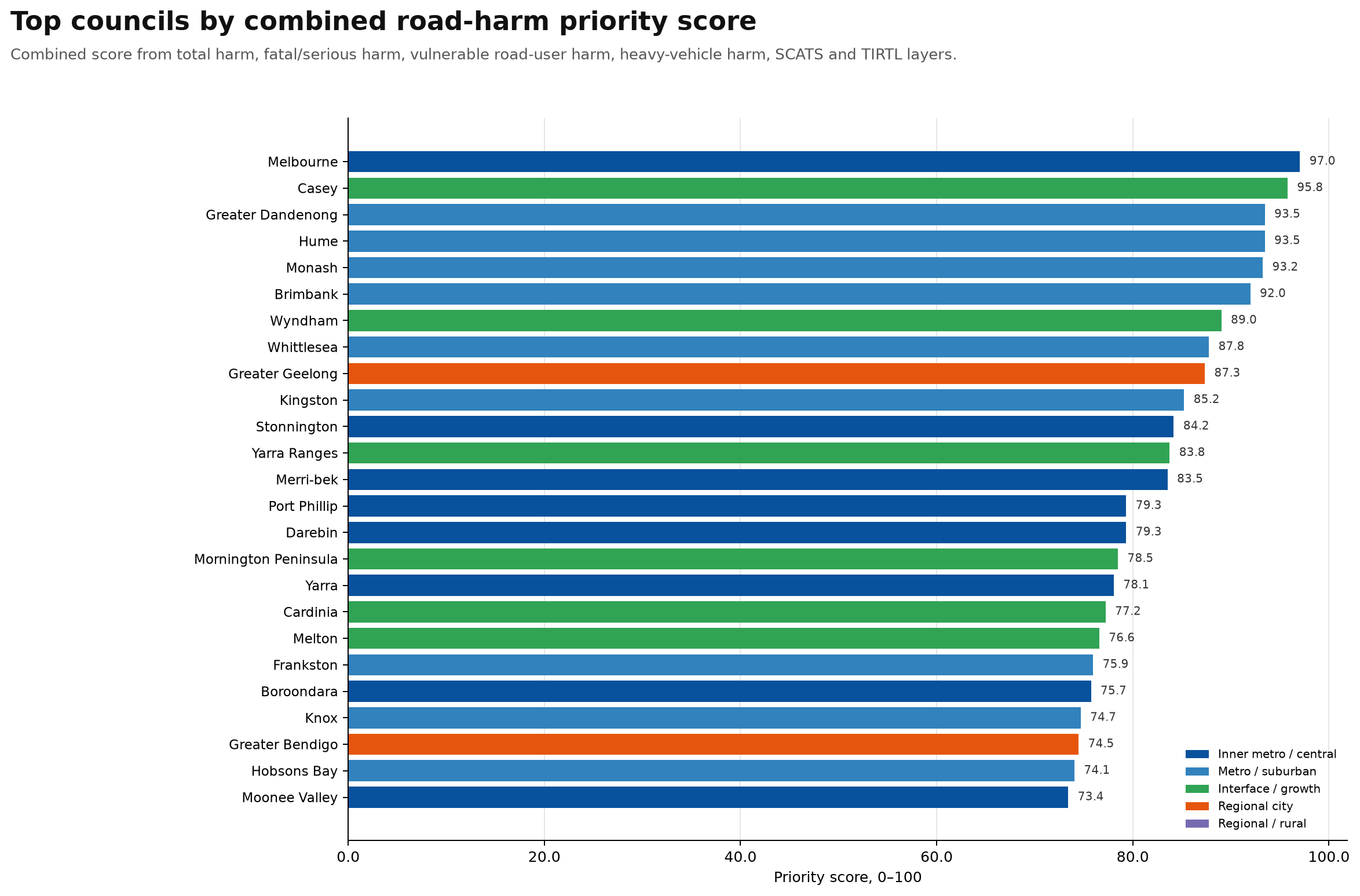
Top councils by combined road-harm priority score
Combined score from total harm, fatal/serious harm, vulnerable road-user harm, heavy-vehicle harm, SCATS and TIRTL layers.
Plain-English interpretation
This graph shows the top councils by combined road-harm priority score across Victoria.
The score combines several layers of evidence:
- total crash harm
- fatal and serious injury harm
- vulnerable road-user harm
- heavy-vehicle harm
- SCATS signal-site exposure
- TIRTL freight-corridor exposure
The highest-ranked councils in this version are Melbourne, Casey, Greater Dandenong, Hume, Monash and Brimbank.
What stands out is that road-harm priority is not just an inner-city issue. The highest-ranked councils include inner metro areas, major suburban growth areas, freight-heavy industrial corridors and large regional cities.
Melbourne has intense inner-city vulnerable road-user and signalised-intersection pressure. Casey, Hume, Wyndham, Cardinia and Melton show the pressure of outer-suburban growth. Greater Dandenong, Brimbank, Monash and Kingston have major freight, arterial road and industrial corridor issues. Greater Geelong and Greater Bendigo show that this is not only a Melbourne problem.
This is not a ranking of council performance. It is a public-interest screening layer showing where the road-harm burden appears most concentrated and where further review may be most justified.
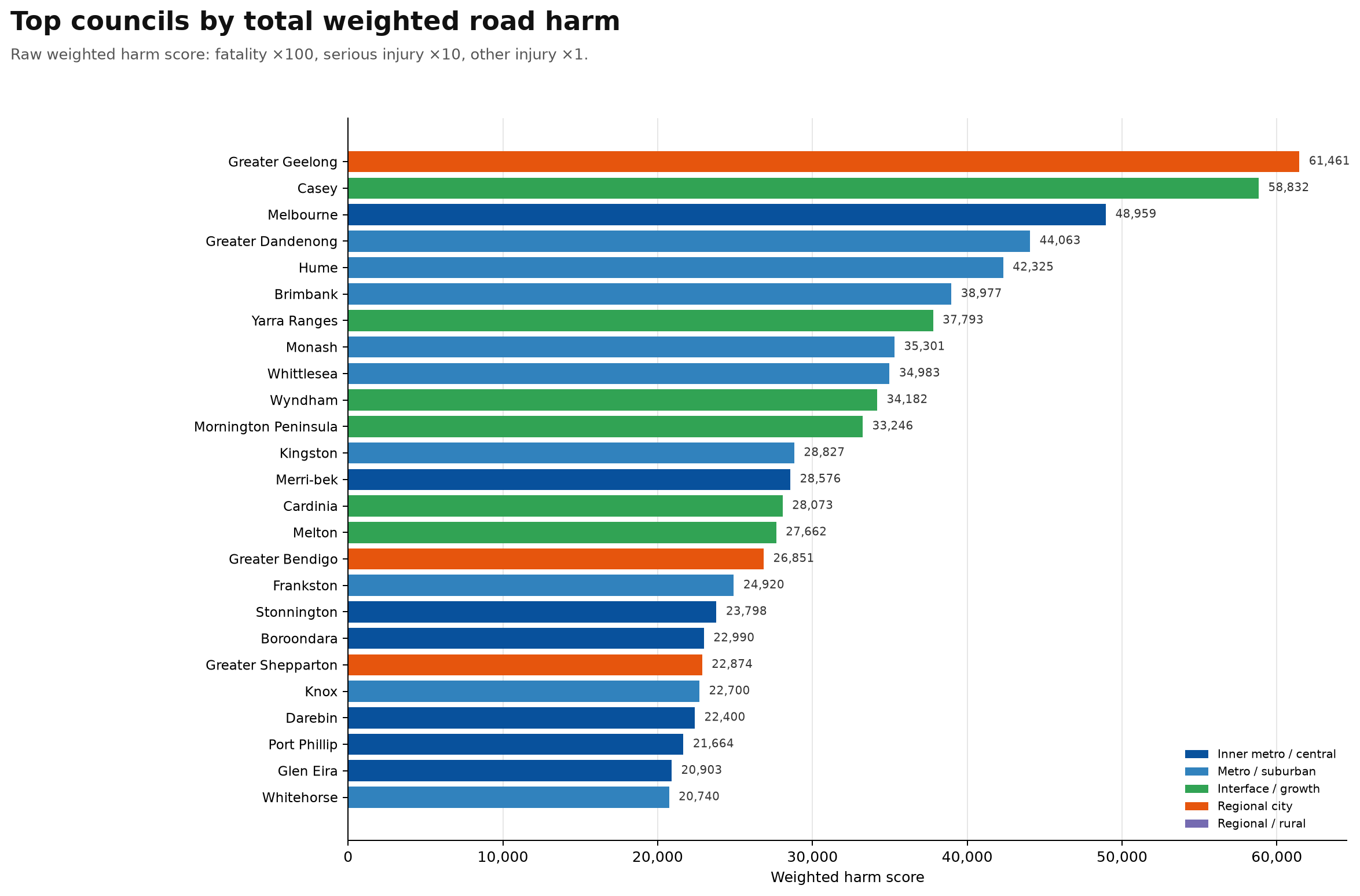
Top councils by total weighted road harm
Raw weighted harm score: fatality ×100, serious injury ×10, other injury ×1.
Plain-English interpretation
This graph shows the top Victorian councils by total weighted road harm.
The weighted harm score is calculated as fatality ×100, serious injury ×10 and other injury ×1.
This is different from the combined priority score. It is a raw harm-burden ranking, so larger councils, regional cities, growth corridors and councils with major arterial road networks tend to rise to the top.
The highest total weighted road-harm councils here are Greater Geelong, Casey, Melbourne, Greater Dandenong, Hume and Brimbank.
What stands out is that Greater Geelong ranks first by total weighted harm, ahead of Melbourne. That makes sense because this graph is not just measuring inner-city intersection pressure. It is measuring the total burden of crash harm across the whole council area.
In plain English: this graph shows where the biggest total road-harm burden is concentrated, not necessarily which council has the highest risk per trip or per kilometre of road.
It is a public-interest screening measure designed to show where the scale of harm is large enough to justify closer review.
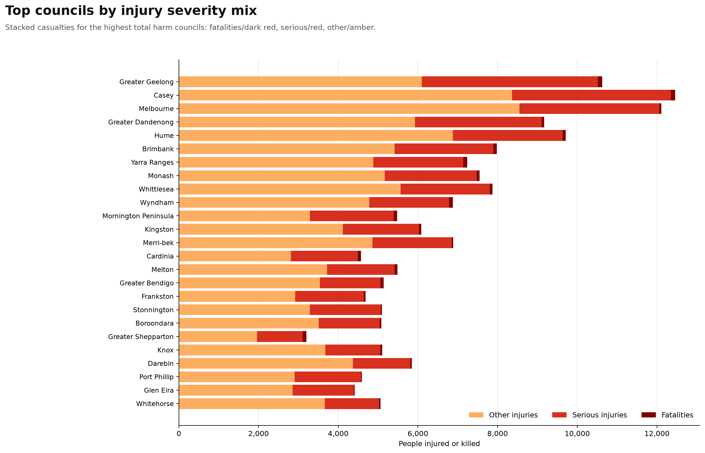
Top councils by injury severity mix
Stacked fatalities, serious injuries and other injuries for top harm councils.
Plain-English interpretation
This graph shows the injury severity mix for the councils with the highest total road-harm burden.
The stacked bars separate casualties into other injuries, serious injuries and fatalities.
This is useful because two councils can have a similar total number of casualties, but a very different severity profile.
Casey and Melbourne have very large total casualty counts, with a substantial serious-injury component. Greater Geelong has the highest total weighted road harm in the previous graph, and here you can see the large overall injury burden behind that ranking.
Greater Dandenong, Hume, Brimbank, Yarra Ranges, Monash, Whittlesea and Wyndham also show large serious-injury loads.
The fatality segments are small visually compared with total injuries, but they carry very high weight in the harm score because each fatality is weighted much more heavily than other injury outcomes.
In plain English: this graph shows not just where crashes happen, but where the consequences are most severe.
It helps separate councils with a high number of lower-severity injuries from councils with a heavier serious-injury and fatality burden. This is not a ranking of council performance. It is a public-interest screening view showing where the scale and severity of road trauma appear most concentrated.
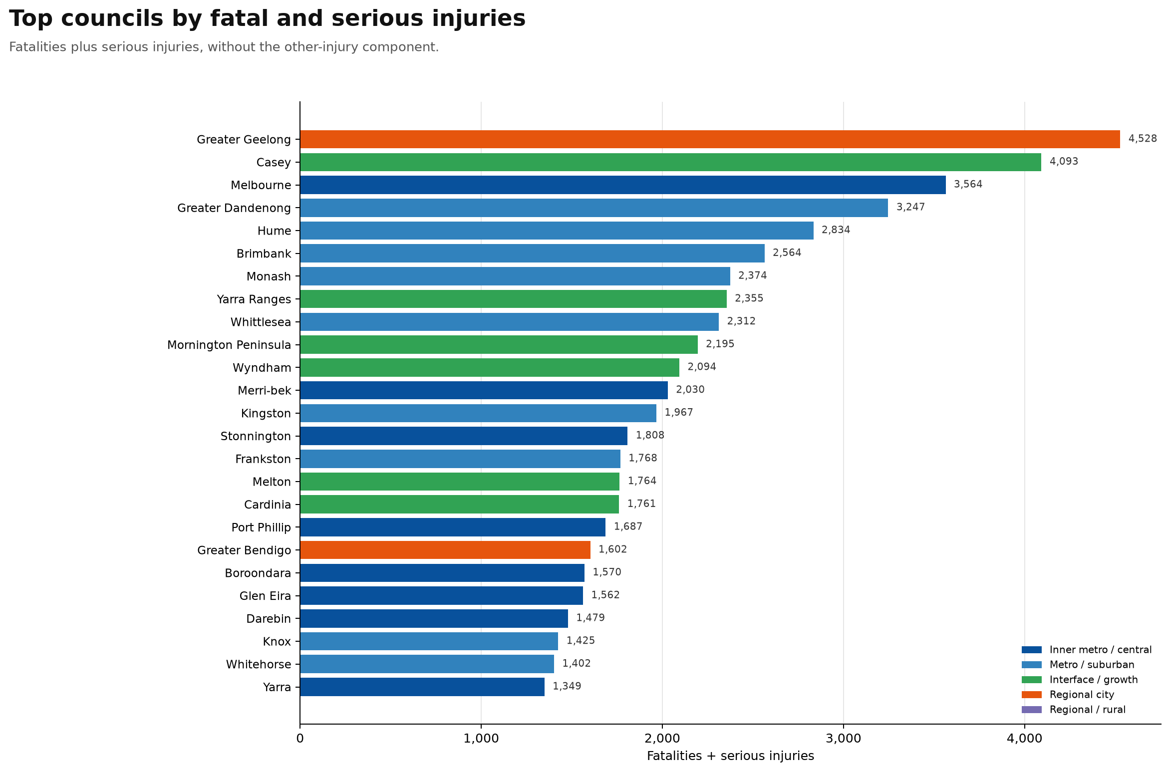
Top councils by fatal and serious injuries
Fatalities plus serious injuries, without the other-injury component.
Plain-English interpretation
This graph focuses only on fatal and serious injuries.
That makes it one of the most important charts, because it removes the lower-severity injury component and looks directly at the outcomes that matter most for road-safety policy.
The highest councils by fatal and serious injuries are Greater Geelong, Casey, Melbourne, Greater Dandenong, Hume and Brimbank.
What stands out again is the mix of places at the top. Greater Geelong ranks first, showing the large serious road-trauma burden in a major regional city. Casey, Hume, Wyndham, Cardinia and Melton show the pressure in outer-suburban growth corridors.
Melbourne, Port Phillip, Stonnington, Yarra, Merri-bek and Darebin show the inner-city and inner-metro serious-injury burden. Greater Dandenong, Brimbank, Monash, Kingston and Whittlesea show the role of major arterials, freight movement and high-volume suburban corridors.
This graph is useful because it is harder to dismiss as just lots of minor crashes. These are the places where people are being seriously injured or killed in large numbers.
It is not a ranking of council performance. It is a public-interest screening view showing where fatal and serious road trauma is most concentrated.
Top councils by vulnerable road-user crash records
Pedestrian, bicycle and motorcycle crash records combined.
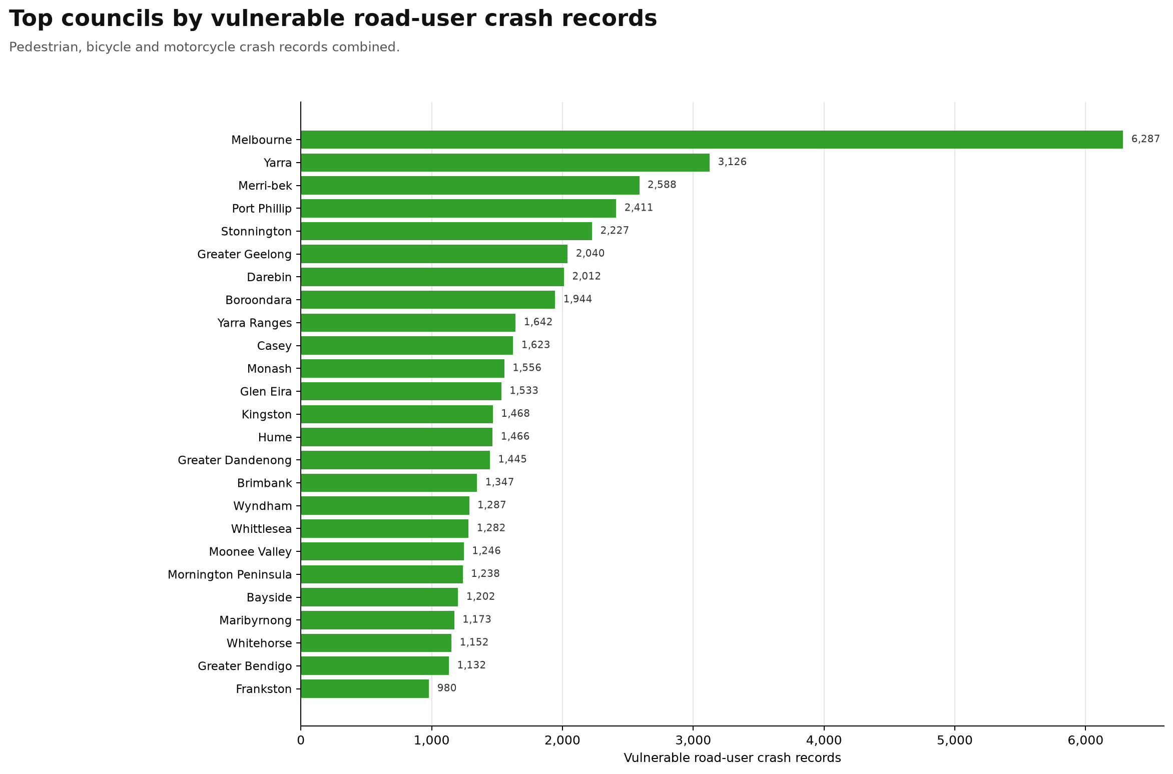
Plain-English interpretation
This graph shows vulnerable road-user crash records by council.
In this analysis, vulnerable road users means pedestrians, bicycle riders and motorcycle riders combined.
The result that stands out immediately is Melbourne. Melbourne has 6,287 vulnerable road-user crash records, which is roughly double the next highest council, Yarra, at 3,126.
The top councils in this graph are heavily inner-metro: Melbourne, Yarra, Merri-bek, Port Phillip, Stonnington, Greater Geelong, Darebin and Boroondara.
This is a very different pattern from the total weighted harm graph. The outer growth councils and freight-heavy arterial councils still matter, but vulnerable road-user harm is especially concentrated in places with high walking, cycling, motorcycling, public transport interchange activity and dense inner-city movement.
In plain English: this graph shows where people outside cars are appearing most often in the crash records.
That makes it highly relevant for pedestrian safety, cycling safety, motorcycle safety, intersection design, speed management, tram corridors, bike corridors and local street safety.
This is not a blame graph. It is a public-interest screening layer showing where vulnerable road-user crash records are most concentrated and where closer review may be justified.
Councils with highest vulnerable road-user crash share
Share of crash records involving pedestrians, bicycle riders or motorcyclists.
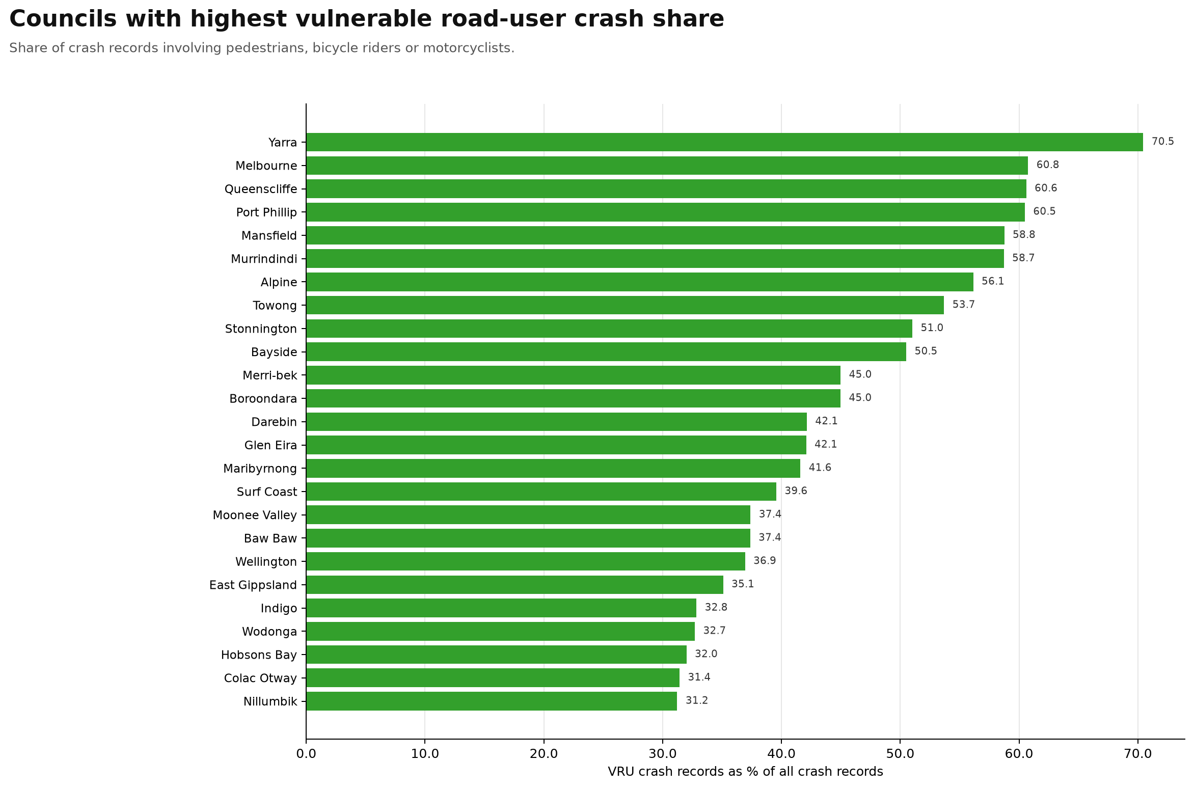
Plain-English interpretation
This graph shows the councils with the highest vulnerable road-user crash share.
This is different from the previous vulnerable road-user graph. The previous graph showed the total number of vulnerable road-user crash records. This graph shows the share of all crash records involving pedestrians, bicycle riders or motorcyclists.
That makes it a very useful character-of-the-road-harm-problem graph.
Yarra is the standout, with vulnerable road users involved in 70.5% of crash records. The highest councils by vulnerable road-user crash share include Yarra, Melbourne, Queenscliffe, Port Phillip, Mansfield, Murrindindi, Alpine, Towong, Stonnington and Bayside.
What stands out is the mix of inner-city councils and regional/tourism councils.
Yarra, Melbourne, Port Phillip, Stonnington, Merri-bek, Darebin and Glen Eira reflect dense inner-metro movement where walking, cycling, motorcycling, trams, shops, nightlife, employment and public transport all overlap.
Queenscliffe, Mansfield, Murrindindi, Alpine and Towong also rank very highly. That suggests a very different kind of vulnerable road-user profile, likely involving tourism, recreation, motorcycles, regional roads, town centres and visitors unfamiliar with local roads.
In plain English: this graph asks a different question. When crashes happen in this council, how often are pedestrians, bicycle riders or motorcyclists involved?
That is why share-based graphs matter. They can reveal councils where vulnerable road-user safety should be central to the road-safety conversation, even if the total number of crashes is smaller than in Melbourne or the big growth corridors.
Top councils by heavy-vehicle crash records
Crash records involving at least one heavy vehicle.
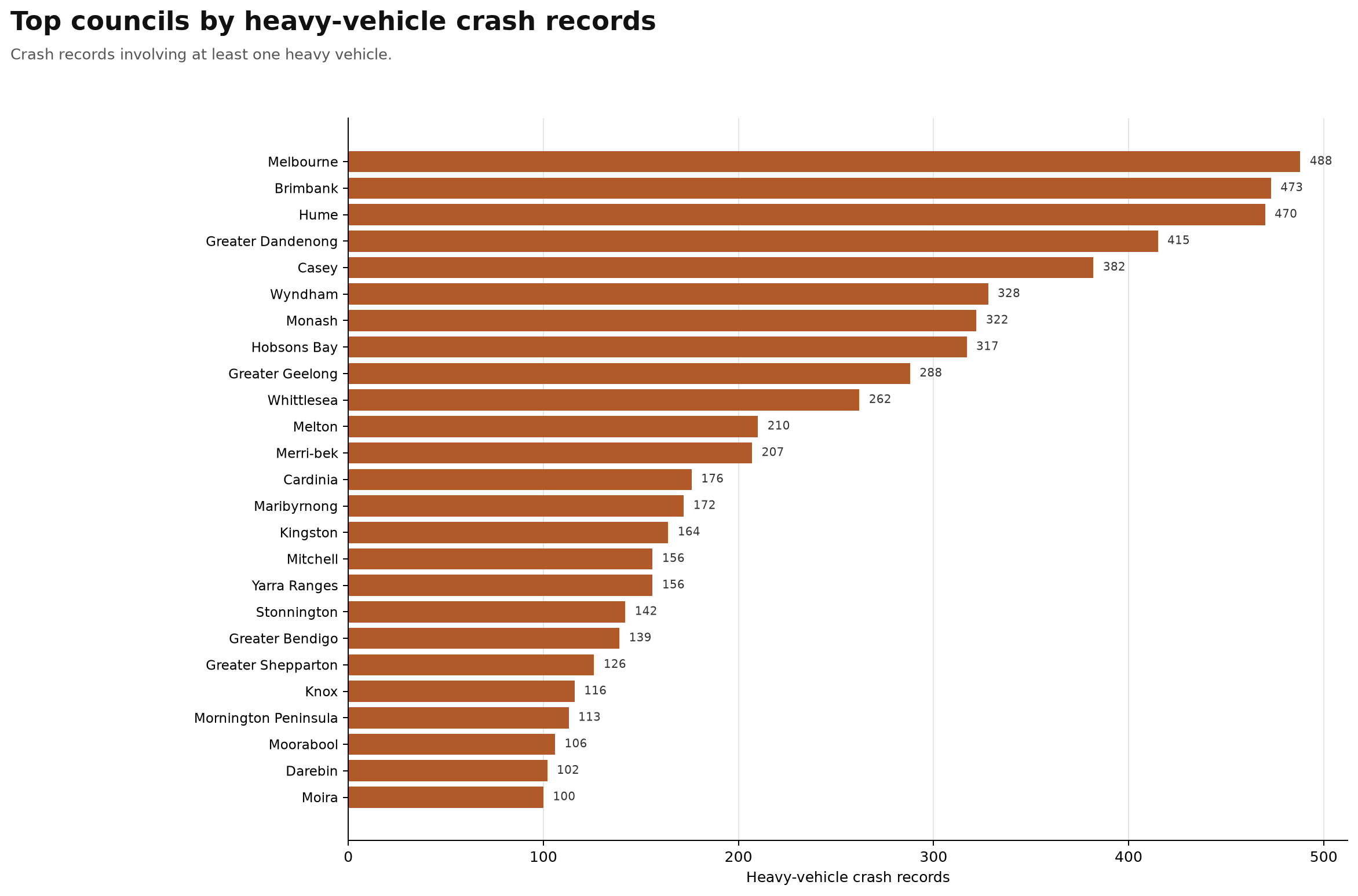
Plain-English interpretation
This graph shows the councils with the highest number of crash records involving at least one heavy vehicle.
The highest councils are Melbourne, Brimbank, Hume, Greater Dandenong, Casey, Wyndham, Monash, Hobsons Bay, Greater Geelong and Whittlesea.
What stands out is how strongly this graph follows Victoria’s freight and arterial-road geography.
Melbourne appears at the top, but the rest of the top group includes many councils with major freight corridors, industrial areas, freeway connections, port-related movements, logistics precincts and high-volume arterial roads.
Brimbank, Hume, Greater Dandenong, Wyndham, Monash, Hobsons Bay and Whittlesea are exactly the kinds of places where heavy vehicles, commuters, local traffic and vulnerable road users can overlap.
Hobsons Bay ranking highly is especially important because it has a relatively small population compared with many of the councils above it, but it carries major freeway, freight and port-related pressure.
This graph does not mean heavy vehicles are always at fault. It means that these are the councils where heavy vehicles appear most often in the crash records, making them important places for freight safety, road design, truck-route planning, intersection review and separation of heavy vehicles from vulnerable road users where possible.
Councils with highest heavy-vehicle crash share
Share of crash records involving at least one heavy vehicle.
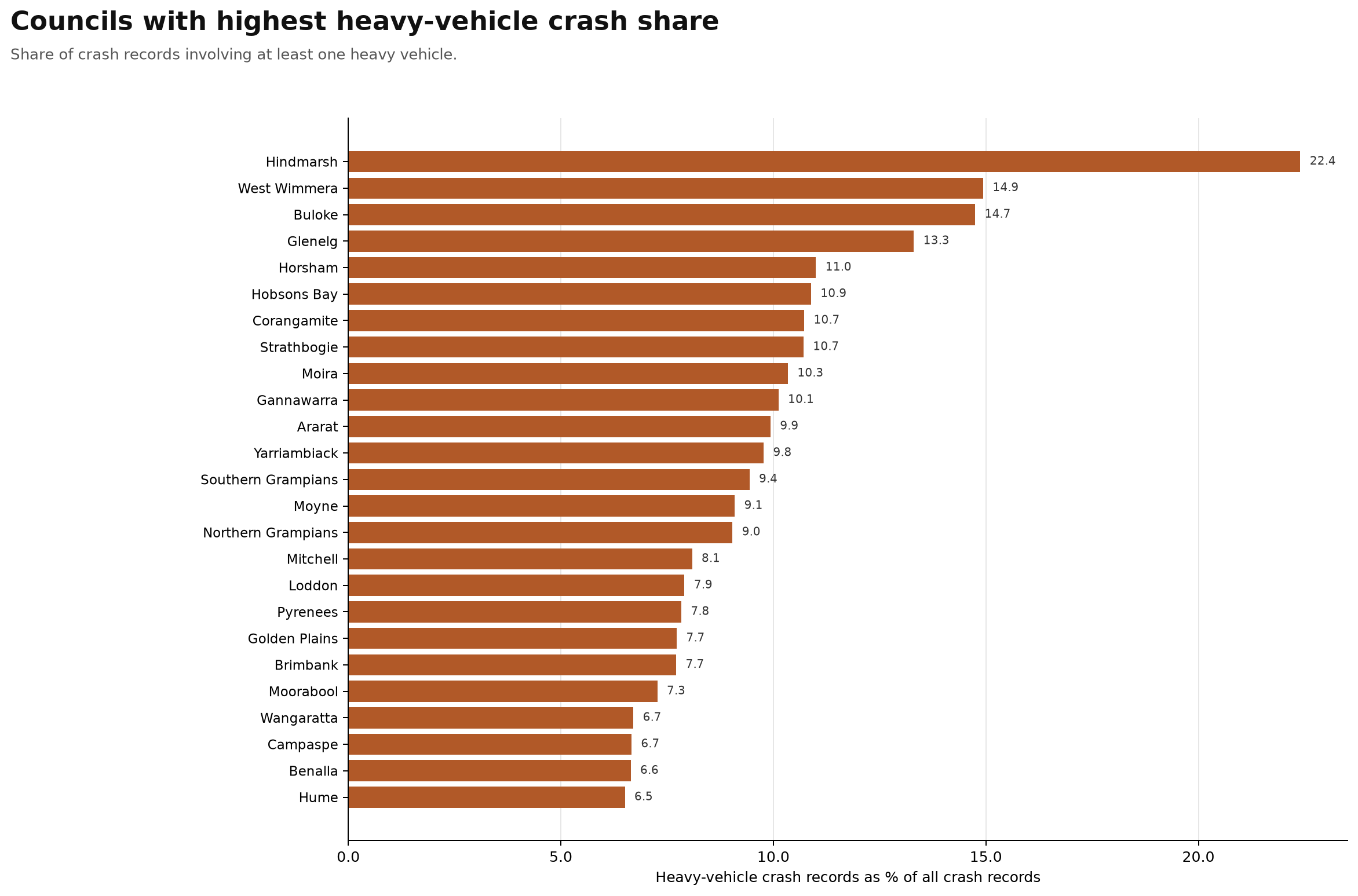
Plain-English interpretation
This graph shows councils with the highest heavy-vehicle crash share.
This is different from the previous heavy-vehicle graph. The previous graph showed the total number of crash records involving heavy vehicles. This graph shows the percentage of all crash records in each council that involve at least one heavy vehicle.
That makes it especially useful for identifying places where heavy vehicles are a major part of the local crash profile, even if the total crash count is smaller.
The highest councils by heavy-vehicle crash share include Hindmarsh, West Wimmera, Buloke, Glenelg, Horsham, Hobsons Bay, Corangamite, Strathbogie, Moira and Gannawarra.
What stands out is the difference between rural/regional freight exposure and metropolitan freight exposure.
Many of the highest-share councils are rural or regional areas where heavy vehicles may make up a larger share of serious road interaction because of highways, long-distance freight routes, agricultural transport, regional arterials and higher-speed roads.
But Hobsons Bay also appears very high, which is notable because it is an inner-metro council. That likely reflects the concentration of freeway, port, industrial and freight movement through a relatively small council area.
In plain English: this graph shows where heavy vehicles make up an unusually large share of the local crash picture. It does not mean heavy vehicles are always at fault. It means these are councils where heavy-vehicle involvement is important enough that freight safety, road design, truck routes, speed environment and separation from vulnerable road users deserve close attention.
Top councils by SCATS-matched road harm
Signal/intersection-adjacent harm captured by the SCATS proximity layer.
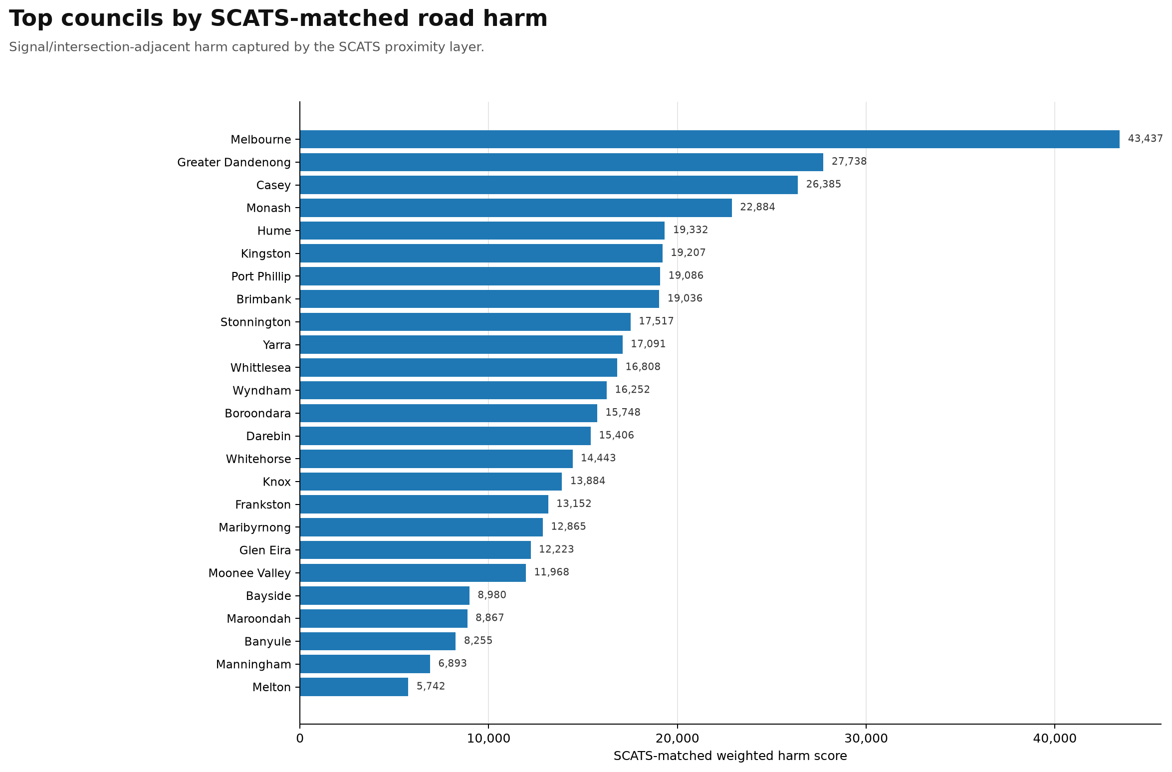
Plain-English interpretation
This graph shows councils with the highest SCATS-matched road harm.
SCATS is Victoria’s traffic signal system, so this graph is focused on road harm captured near signalised intersections and signal-adjacent locations.
That makes this a very important intersection-safety chart.
The highest councils by SCATS-matched weighted road harm are Melbourne, Greater Dandenong, Casey, Monash, Hume, Kingston, Port Phillip, Brimbank, Stonnington and Yarra.
Melbourne is the clear standout, with a much higher SCATS-matched harm score than any other council.
That suggests a very large share of Melbourne’s road-harm burden is concentrated around signalised intersections, where pedestrians, cyclists, motorcyclists, cars, trucks, trams, buses and turning traffic all interact.
Greater Dandenong, Casey, Monash, Hume, Kingston and Brimbank also rank very highly, which points to the importance of major arterial intersections, high-volume suburban corridors and freight/commuter routes.
In plain English: this graph shows where signalised-intersection-adjacent harm appears most concentrated.
That matters because intersections are places where targeted safety improvements can be highly practical: signal timing, protected turns, pedestrian crossings, bike protection, speed management, truck-turning treatments, visibility improvements and conflict reduction.
This is not an engineering safety audit. It is a public-interest screening layer showing which councils appear to have the largest burden of road harm around signalised intersections, and therefore where closer review may be most justified.
Top councils by TIRTL freight-conflict harm
Heavy-vehicle crash harm captured by the TIRTL freight-corridor proximity layer.
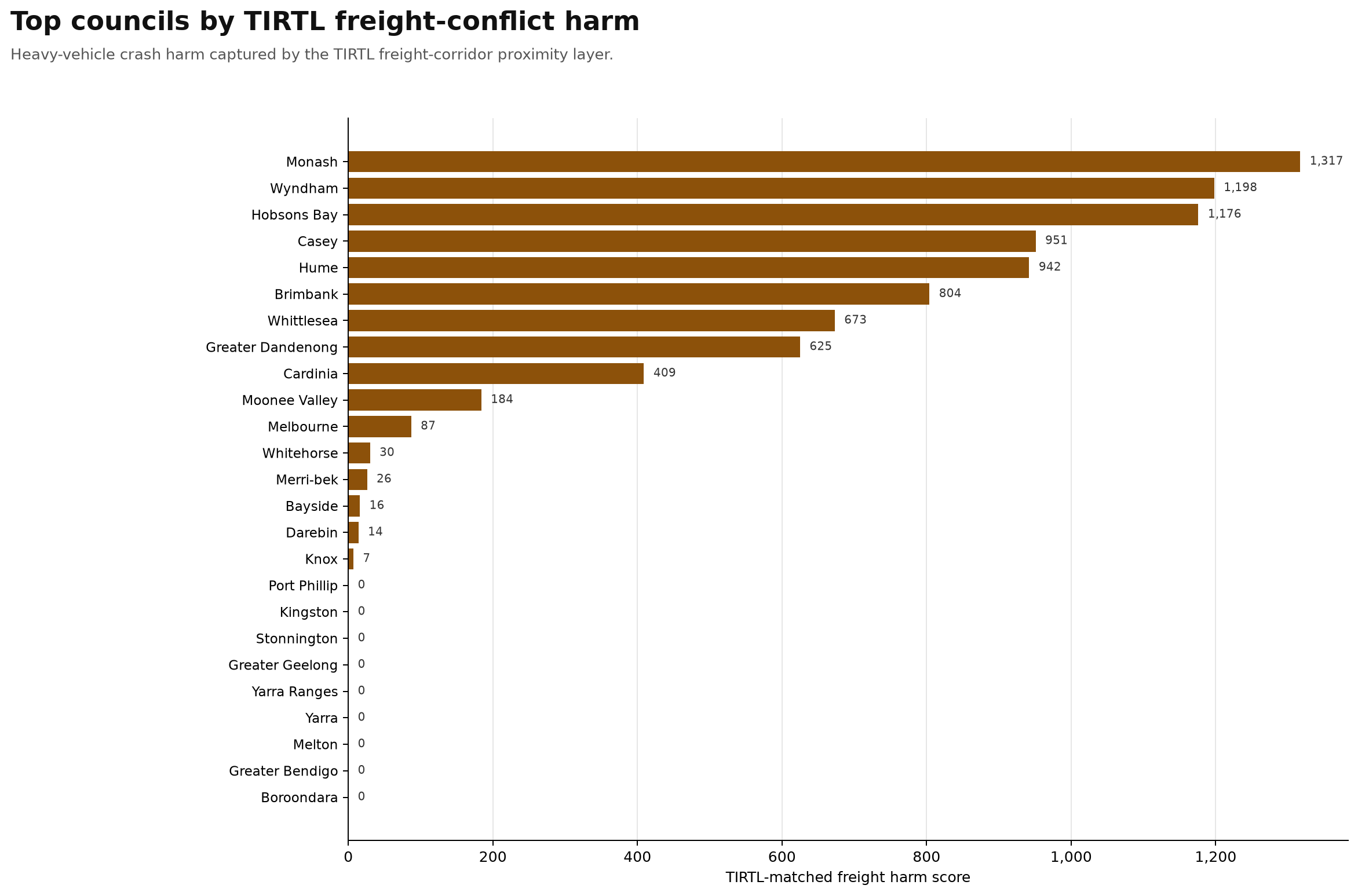
Plain-English interpretation
This graph shows TIRTL freight-conflict harm by council.
TIRTL is the freight and traffic sensor layer, so this graph is focused on heavy-vehicle crash harm captured near freight corridors.
The highest councils by TIRTL-matched freight-conflict harm are Monash, Wyndham, Hobsons Bay, Casey, Hume, Brimbank, Whittlesea, Greater Dandenong, Cardinia and Moonee Valley.
What stands out is that this is a very different ranking from the general road-harm graphs. Melbourne ranks very highly on total road harm and SCATS-matched intersection harm, but it is much lower here.
This graph is really showing the freight-corridor layer.
Monash, Wyndham, Hobsons Bay, Casey, Hume, Brimbank, Whittlesea and Greater Dandenong are exactly the kinds of places where heavy vehicles, freeways, industrial areas, logistics movements, commuter traffic and arterial roads overlap.
Hobsons Bay ranking third is especially significant because it is a relatively small inner-metro council, but it carries major freight and freeway pressure linked to the West Gate corridor, port-related movement and industrial land use.
The councils with zero or very low scores should not automatically be read as having no freight risk. It may also reflect where the TIRTL freight-corridor proximity layer has coverage.
In plain English: this graph shows where heavy-vehicle crash harm is most visible in the freight-corridor sensor layer.
It is not saying heavy vehicles are always at fault. It is showing where freight movement and road-harm records overlap strongly enough to justify closer review of truck routes, freeway ramps, arterial intersections, industrial access roads and vulnerable road-user conflict points.
Total road harm by council group
Grouped summary for broad geographic/urban context. Grouping is for chart readability, not an official classification.
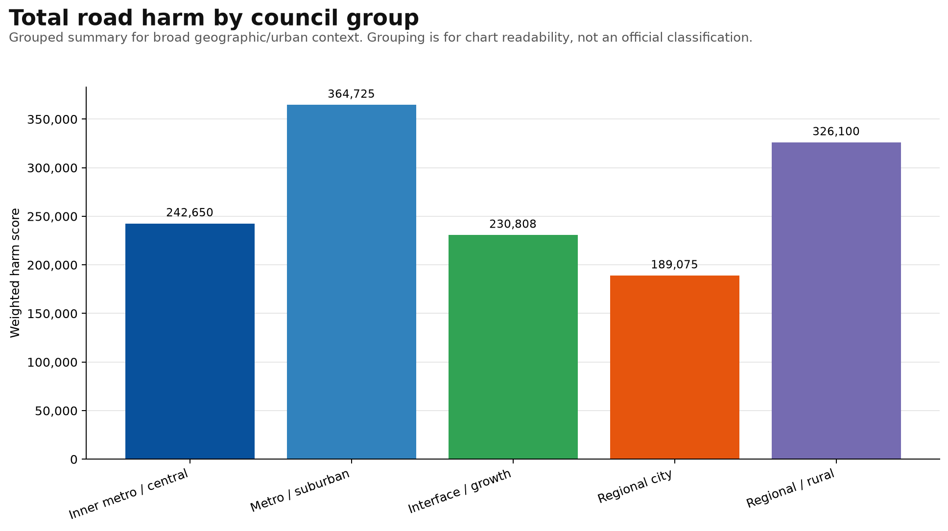
Plain-English interpretation
This graph shows total weighted road harm by broad council group.
The groups are for chart readability, not official classifications.
What stands out is that the largest total road-harm burden is not only in inner Melbourne. Metro/suburban councils have the highest combined weighted harm score, followed by regional/rural councils.
That is important because it shows Victoria’s road-harm problem is spread across very different environments.
Inner metro / central areas have dense pedestrian, cyclist, tram, public transport and intersection pressure. Metro/suburban areas carry huge volumes of daily traffic, arterial roads, shopping strips, schools, commuters and freight routes.
Interface/growth areas show the pressure of fast-growing outer suburbs, new housing, long commutes and road networks trying to keep up with population growth. Regional cities carry major local traffic plus highway, freight and visitor traffic. Regional/rural areas have a very large total harm burden, likely reflecting higher-speed roads, longer travel distances, freight, agricultural movement and crash severity.
In plain English: this graph shows that road harm is not one problem. It is several different problems happening in different places.
That is why a single statewide road-safety strategy needs local detail. The pattern of harm changes depending on the road environment.
Vulnerable road-user crashes by council group
Pedestrian, bicycle and motorcycle crash records combined by broad council group.
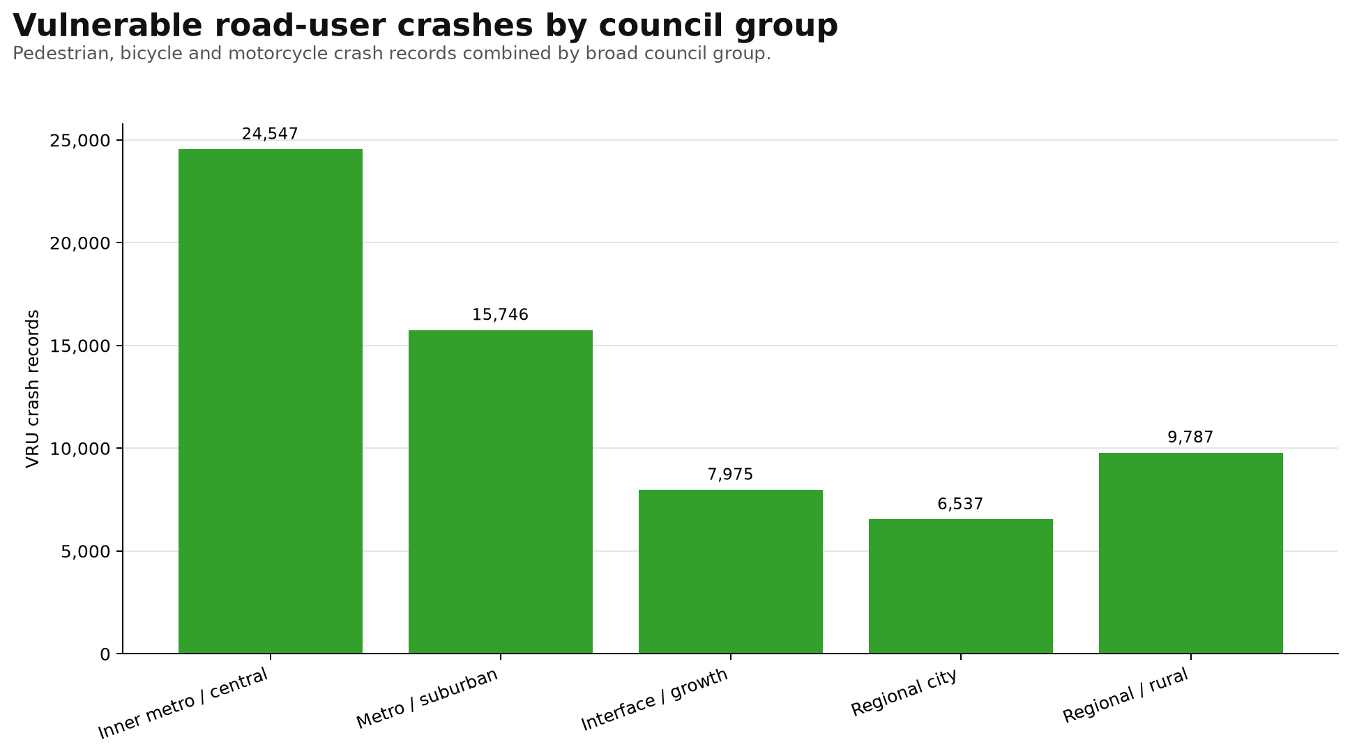
Plain-English interpretation
This graph shows vulnerable road-user crash records grouped by broad council type.
Vulnerable road users here means pedestrians, bicycle riders and motorcycle riders combined.
What stands out is how dominant the inner metro / central group is. Even though inner Melbourne is a much smaller geographic area than regional/rural Victoria, it has the largest vulnerable road-user crash burden in this grouping.
That likely reflects the intensity of walking, cycling, motorcycling, public transport access, tram corridors, shopping streets, nightlife, commuting and dense intersection activity.
Metro/suburban councils also have a large vulnerable road-user burden, which likely reflects major activity centres, schools, shopping strips, railway stations, bus corridors, arterial roads and local cycling/walking routes.
Regional/rural areas also show a substantial vulnerable road-user crash count, which is important because vulnerable road-user risk is not only an inner-city issue.
In plain English: this graph shows that vulnerable road-user safety is especially concentrated in inner metro areas, but it remains a statewide issue.
The response needed in inner Melbourne may be different from the response needed in suburban, growth, regional city or rural areas.
This is a public-interest screening view, not an engineering safety audit. It shows where vulnerable road-user crash records are concentrated and where closer review may be justified.
Heavy-vehicle crashes by council group
Heavy-vehicle crash records combined by broad council group.
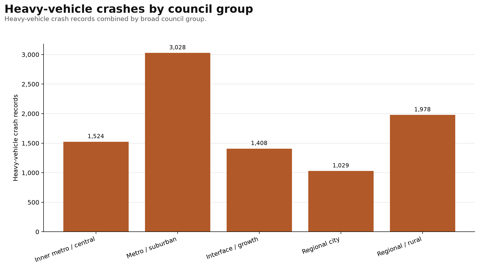
Plain-English interpretation
This graph shows heavy-vehicle crash records grouped by broad council type.
What stands out is that metro/suburban councils have the highest number of heavy-vehicle crash records.
That likely reflects the huge amount of heavy vehicle movement through suburban Melbourne: freight corridors, industrial areas, logistics precincts, arterial roads, freeway ramps, shopping centres, construction activity and commuter traffic all overlapping.
Regional/rural areas are also very high, which makes sense because heavy vehicles are a major part of highway, agricultural, long-distance freight and regional transport networks.
Inner metro / central areas have fewer heavy-vehicle crash records than metro/suburban areas overall, but those crashes can be especially important because they occur in denser environments where trucks, pedestrians, cyclists, trams, buses and local traffic may be sharing limited road space.
Interface/growth areas also show a substantial heavy-vehicle burden, likely reflecting rapid development, construction traffic, expanding arterial networks, new industrial land and long commuter routes.
In plain English: this graph shows that heavy-vehicle safety is not only a rural highway issue. It is also a major suburban and growth-corridor issue.
This is a public-interest screening view. It does not say heavy vehicles are always at fault. It shows where heavy vehicles appear most often in crash records and where closer review may be justified.
Crash records versus weighted harm
Councils above the general cloud have more severe harm for their crash count.
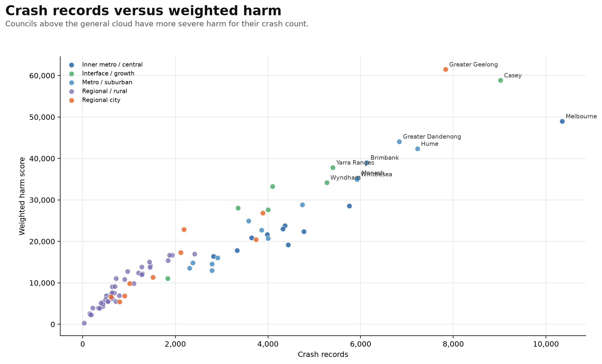
Plain-English interpretation
This graph compares the number of crash records in each council with the total weighted road-harm score.
It helps separate two different things: how many crash records a council has, and how severe the harm from those crash records appears to be.
Most councils follow the general pattern: more crash records usually means more total harm.
But the really interesting councils are the ones sitting above the general cloud, because they appear to have more severe harm for their crash count.
Greater Geelong stands out strongly. It has fewer crash records than Melbourne, but a higher weighted harm score. That suggests the crash outcomes in Greater Geelong are, on average, more severe.
Casey also sits very high, showing both a large crash count and a very high harm burden.
Melbourne is far to the right because it has the largest crash-record count, but its weighted harm score is lower than Greater Geelong and Casey. That suggests Melbourne has a very large volume of crashes, but the average severity profile differs from some other high-harm councils.
In plain English: this chart shows that the number of crashes is not the whole story. Some places have many crashes. Some places have fewer crashes but more severe outcomes.
The most important places to examine are the councils with both high crash volume and high weighted harm, or those sitting unusually high for their crash count.
This is why weighted harm matters. It gives more weight to deaths and serious injuries, rather than treating every crash record as equal.
VRU share versus harm per crash
Shows whether councils with higher vulnerable road-user crash shares also show higher average harm.
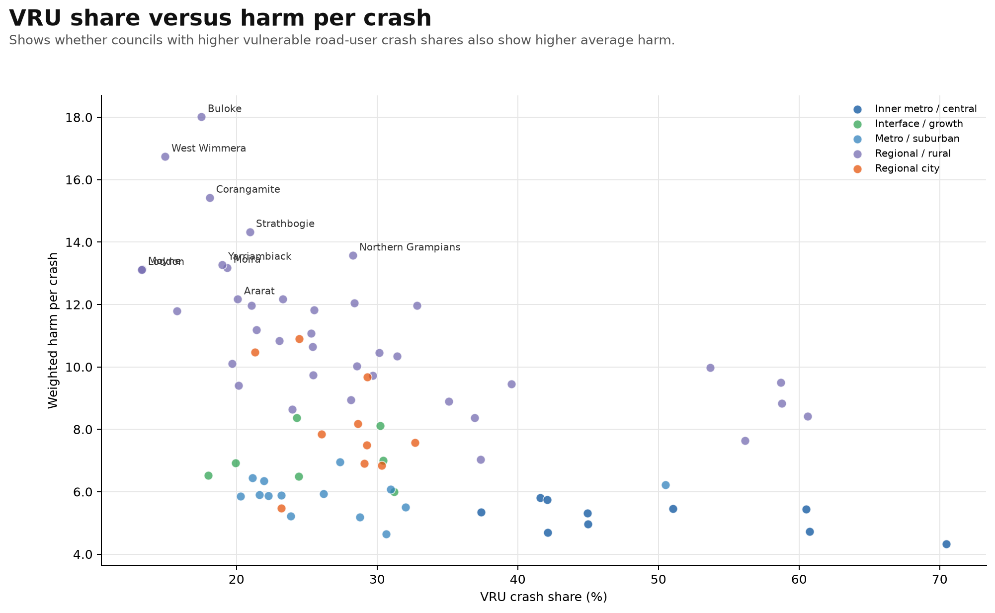
Plain-English interpretation
This graph compares vulnerable road-user crash share with weighted harm per crash.
The horizontal axis shows the percentage of crash records involving pedestrians, bicycle riders or motorcyclists. The vertical axis shows average weighted harm per crash.
This helps answer an important question: do councils with a higher vulnerable road-user crash share also tend to have more severe crash outcomes?
The answer appears to be: not always.
Many inner metro councils have very high vulnerable road-user crash shares, but their average harm per crash is often lower than many regional and rural councils.
That likely reflects the difference between dense urban crashes and higher-speed regional crashes.
In inner Melbourne, there are many vulnerable road-user crash records because there are many pedestrians, cyclists, motorcyclists, intersections, tram corridors and activity centres.
But in regional and rural areas, even where the vulnerable road-user share is lower, crash outcomes can be more severe because of higher speeds, longer distances, highway exposure, motorcycle routes and rural road environments.
In plain English: this graph shows two different road-safety problems. Inner metro councils have a high concentration of vulnerable road-user crashes. Regional and rural councils may have fewer vulnerable road-user crashes, but the crashes can be more severe.
That means the solutions are likely different. This is why road-safety analysis needs more than one graph.
Heavy-vehicle crashes versus TIRTL freight harm
Compares total heavy-vehicle crash records with the TIRTL-matched freight harm layer.
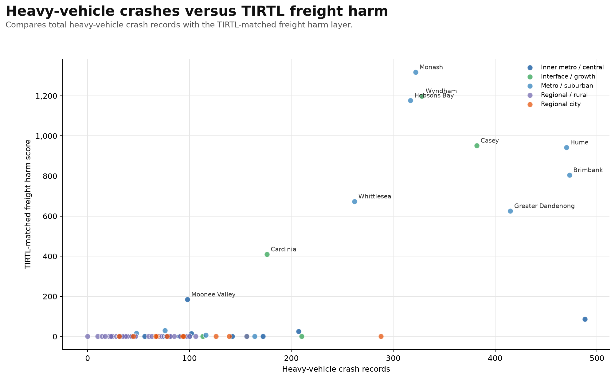
Plain-English interpretation
This graph compares total heavy-vehicle crash records with TIRTL-matched freight harm.
The horizontal axis shows the number of crash records involving at least one heavy vehicle. The vertical axis shows the freight harm captured by the TIRTL freight-corridor proximity layer.
This helps separate two different questions: where do heavy vehicles appear most often in crash records, and where does heavy-vehicle harm overlap most strongly with monitored freight corridors?
The councils standing out in the upper part of the graph are Monash, Wyndham, Hobsons Bay, Casey, Hume, Brimbank, Whittlesea, Greater Dandenong and Cardinia.
These are the councils where the TIRTL freight-corridor layer is picking up the strongest heavy-vehicle harm signals.
Hobsons Bay is especially notable because it has fewer heavy-vehicle crash records than Melbourne, Brimbank, Hume, Greater Dandenong and Casey, but it sits very high on TIRTL-matched freight harm.
That suggests the heavy-vehicle crashes in Hobsons Bay are strongly aligned with major freight corridors, which makes sense given the West Gate corridor, port-related movement, industrial land, freeway ramps and truck routes through a relatively small council area.
Monash also stands out strongly, with the highest TIRTL-matched freight harm score in this view.
In plain English: this graph shows where heavy-vehicle crash records and freight-corridor harm overlap most strongly.
It does not mean heavy vehicles are always at fault. It means these are the places where freight movement, crash harm and monitored freight corridors line up strongly enough to justify closer review of truck routes, freeway access, arterial intersections, industrial access, ramp design and vulnerable road-user conflict points.
Top council priority profile
Normalised component scores for the top councils.
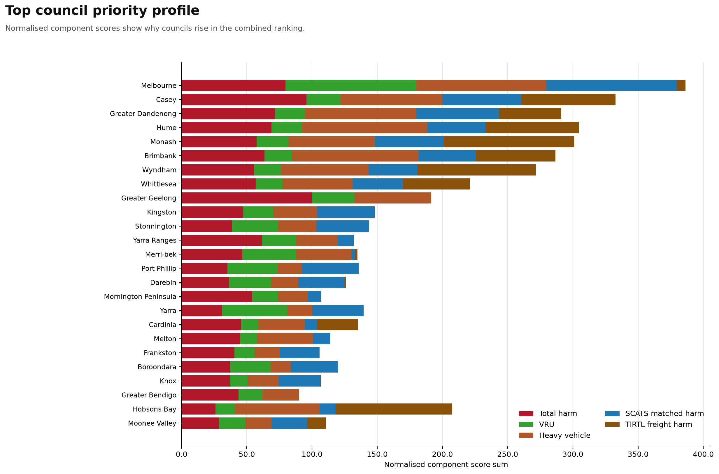
Plain-English interpretation
This graph explains why councils rise in the combined road-harm priority ranking.
Instead of showing one raw number, it breaks the combined score into component layers: total harm, vulnerable road-user harm, heavy-vehicle harm, SCATS-matched intersection harm and TIRTL freight harm.
This is useful because different councils rise in the ranking for different reasons.
Melbourne ranks at the top because it has a very broad road-harm profile. It has high total harm, very high vulnerable road-user harm, heavy-vehicle involvement and a very large SCATS-matched intersection harm component.
Casey, Greater Dandenong, Hume, Monash, Brimbank, Wyndham and Whittlesea rise because they combine large total road-harm burdens with suburban arterial, freight, growth and intersection pressure.
Greater Geelong ranks highly mainly because of its large total harm burden, but it does not show the same TIRTL freight-harm component as some of the metro freight corridor councils.
Hobsons Bay is one of the most interesting cases. Its overall bar is not driven by total size alone. It has a very large TIRTL freight-harm component relative to its size, which helps explain why it matters in a freight-conflict analysis even though it is a smaller council.
In plain English: this chart shows that road harm is not the same everywhere. Some councils rise because they have a large total crash-harm burden. Some rise because vulnerable road users are heavily involved. Some rise because freight and heavy vehicles are a major part of the local risk picture. Some rise because harm is concentrated around signalised intersections.
That is why a single ranking is useful, but the component breakdown is even more useful. It shows what kind of road-safety problem each council appears to have.